WhatsApp Business (WB) For Chipotle
Currently, WhatsApp Business only caters to small businesses.
In this concept casetsudy, we explore
WhatsApp Business (WB) for Large Businesses
and though the landscape of large businesses is very diverse, for this casestudy we look at the problem from the lens of a large business in the Fast Food sector, Chipotle.
Note: This project is not affiliated to WhatsApp or Chipotle in any capacity.
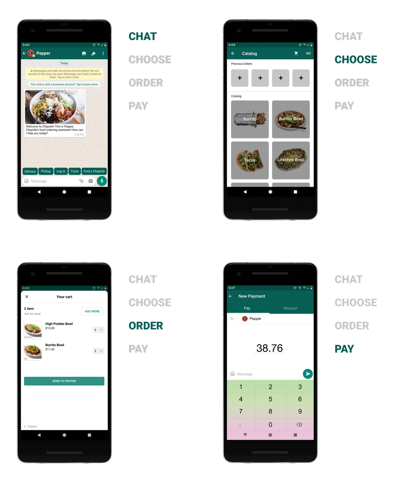
Role-
Product designer, UI designer
Timeline-
June 2021- September 2021
Skills-
Discovering opportunity, Competitive analysis, Scoping requirements, Information architecture, UI design, User research, Wireframing, Prototyping, Usability studies.
WhatsApp Business - the best suited conversational ecommerce platform for Users.
Marketplace experience offers no personalized ordering. Users have to download these app seperately.

Ecommerce via chat but no co-hesive experience. A lengthy chat with bots and third party links to place orders creates long order time for users.

With huge market penetration and WB suite, Users can enjoy food ordering through their everyday messaging app with co-hesive experience
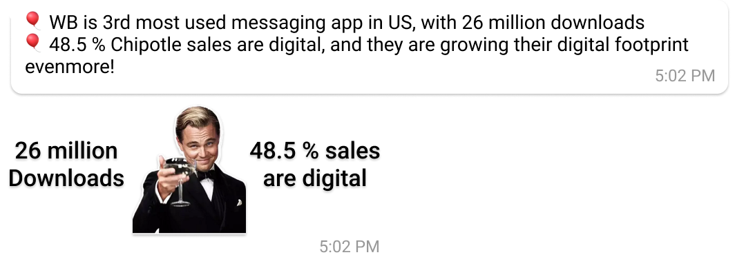
How will it help Chipotle & WB?



Analyzing Chipotle's offerings
I studied Chipotle, Dominoes and McDonald's catalog, to discover that most of the large food restaurants have a similar patterns in their catalog. All have a Main and secondary menu with Ready-to-go dishes and customizable ones.
1. Main menu
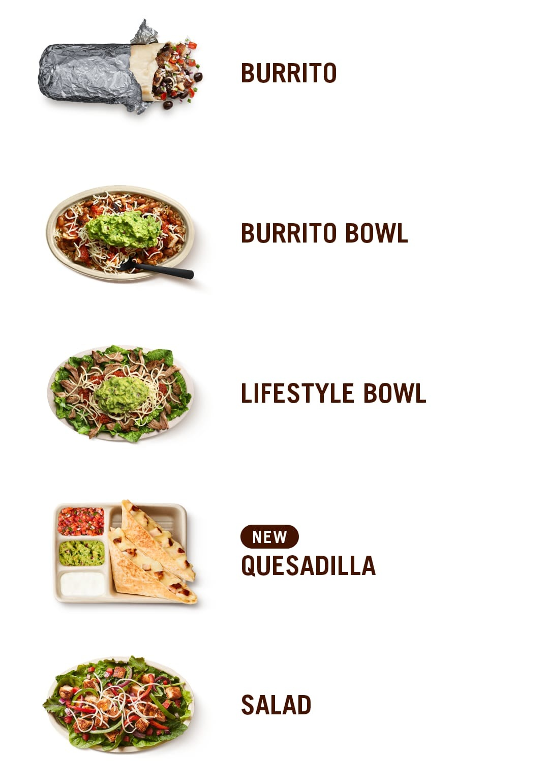
2. Secondary menu
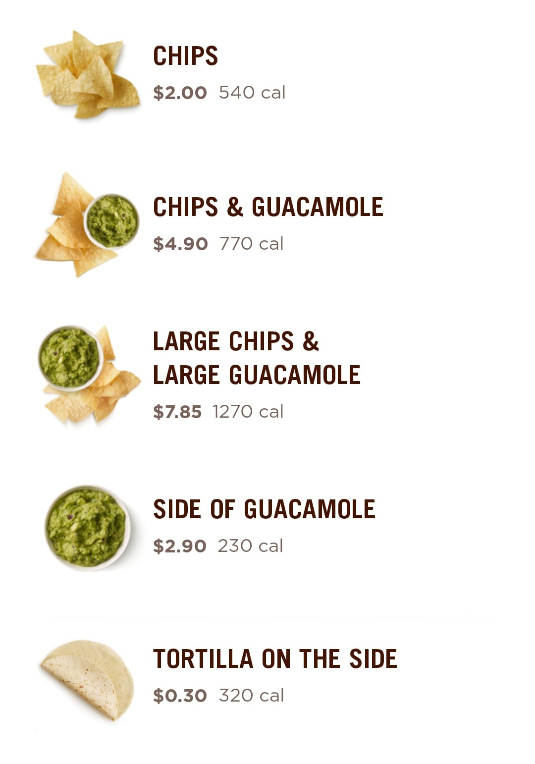
3. Ready to go dishes
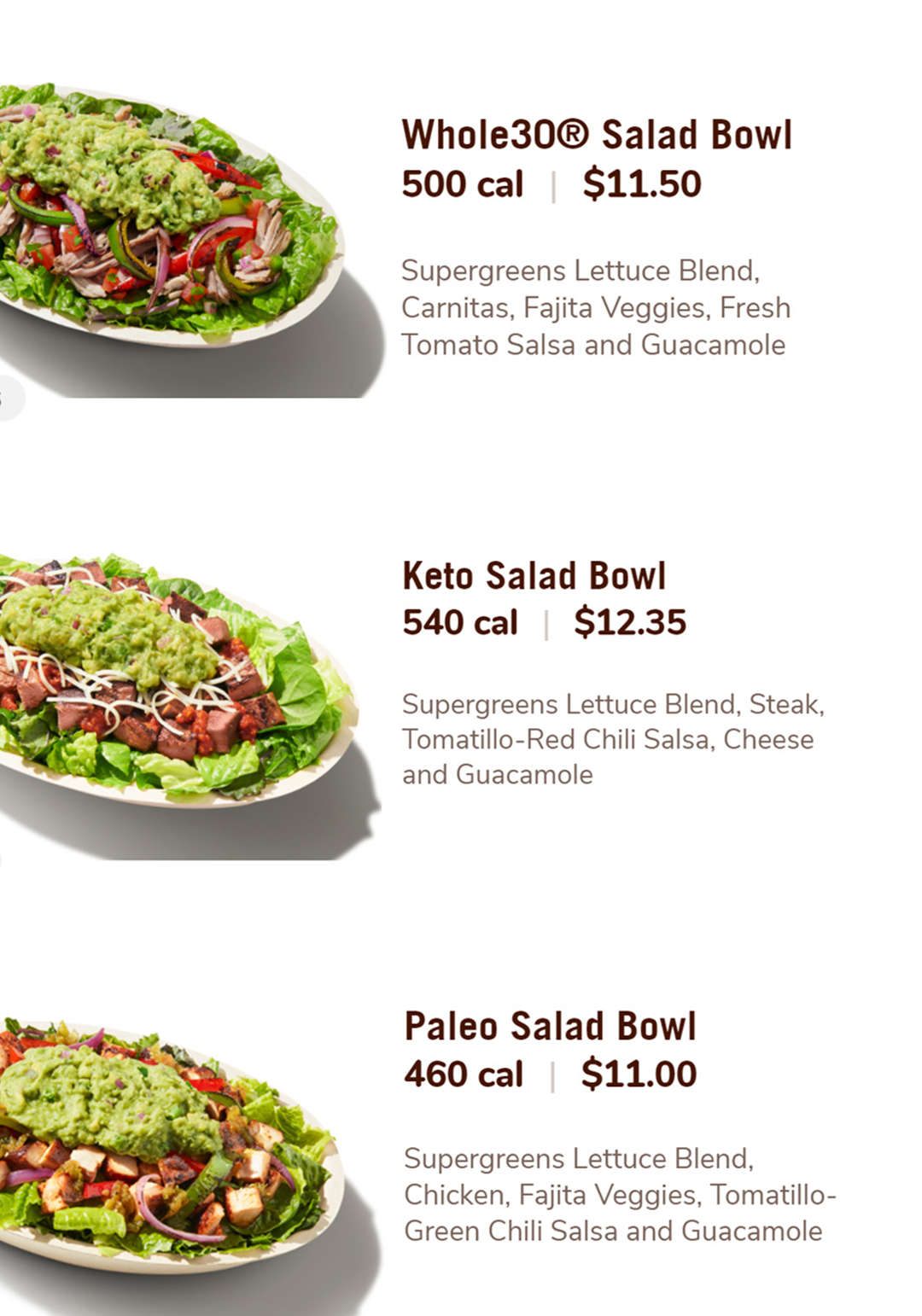
4. Build your own dishes
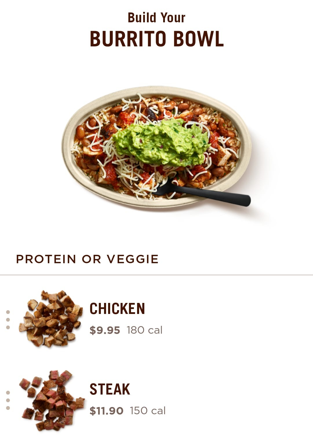
Analyzing what WB has to offer
1. Main Menu
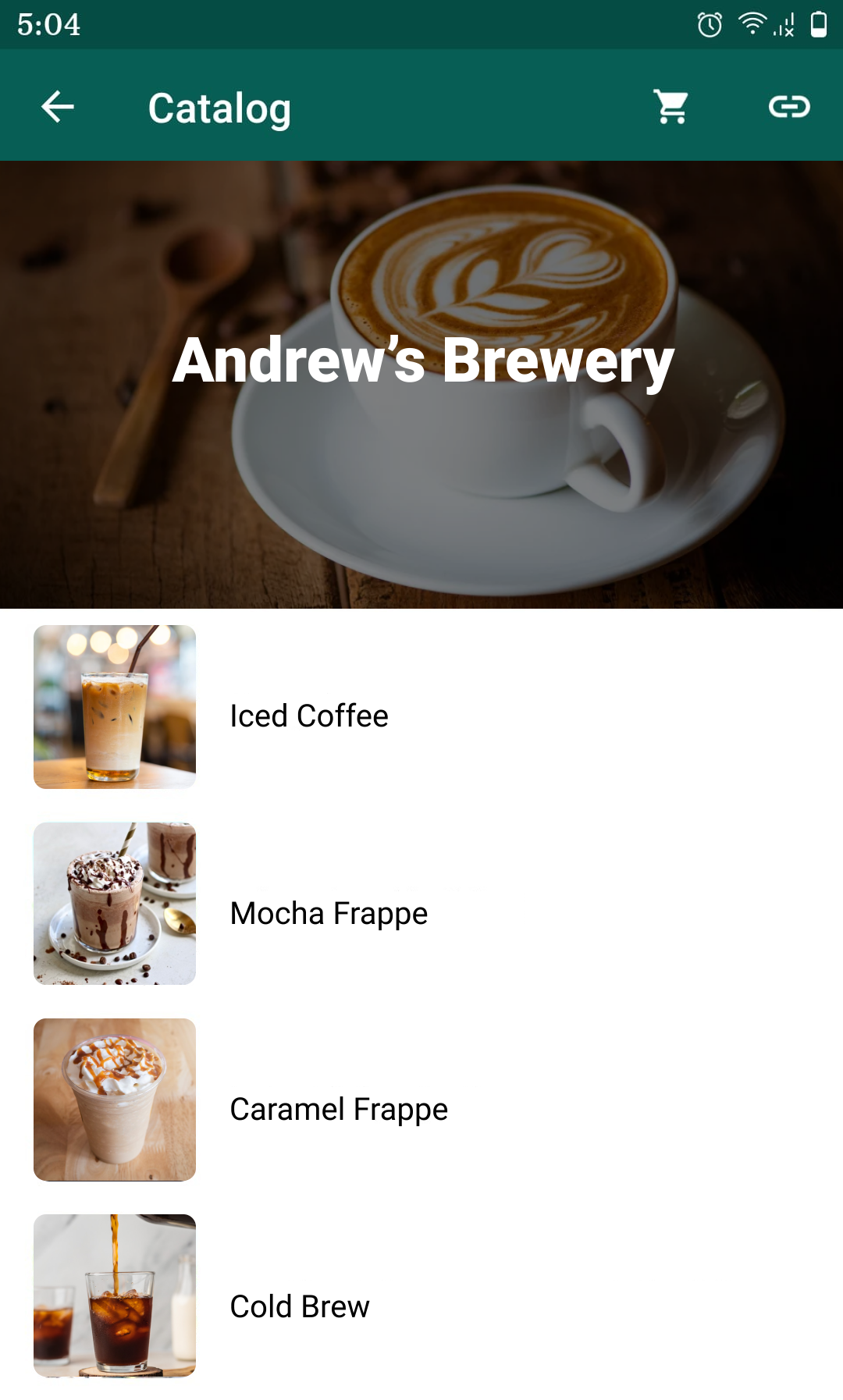
2. Product Page
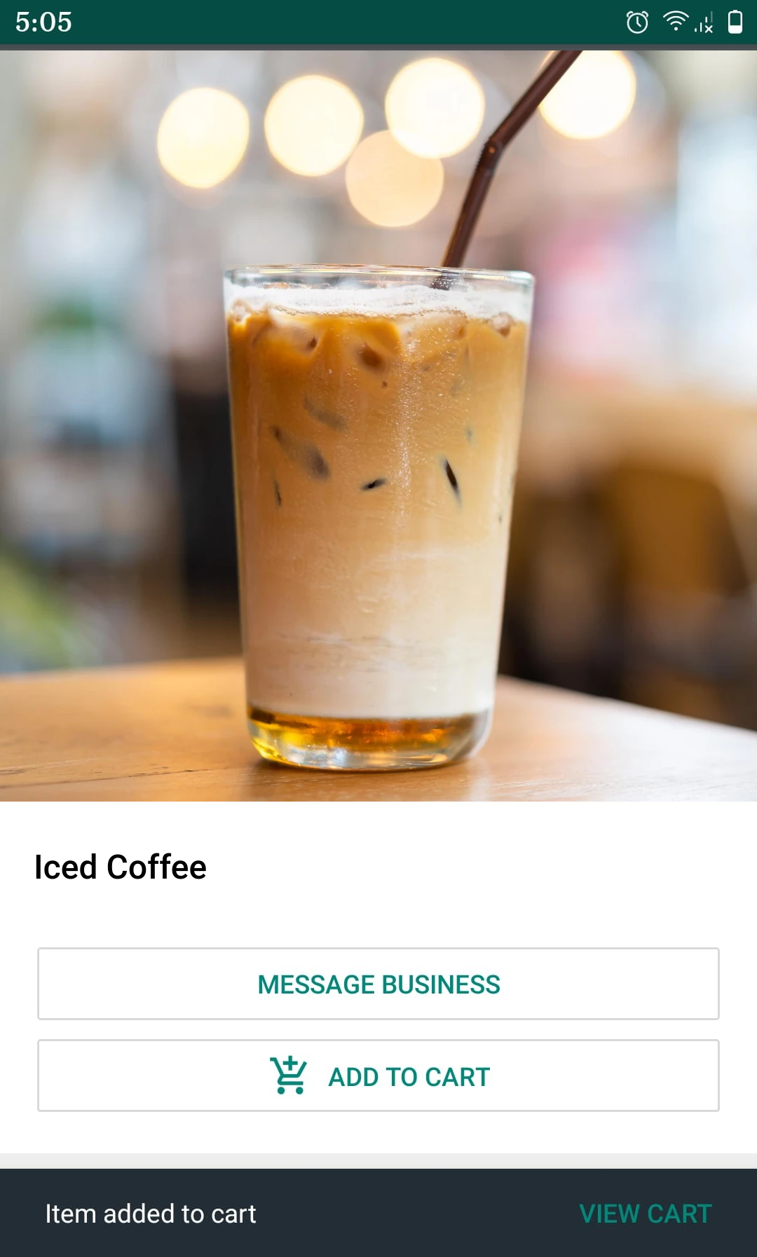
3. Cart Pop-up
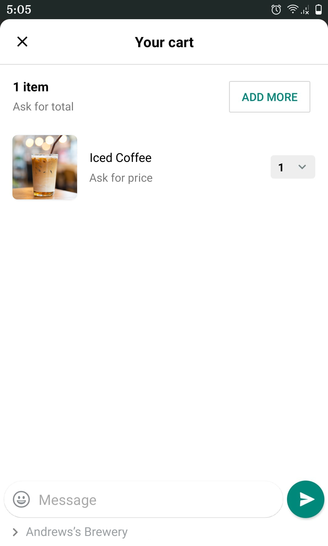
4. Cart confirmation
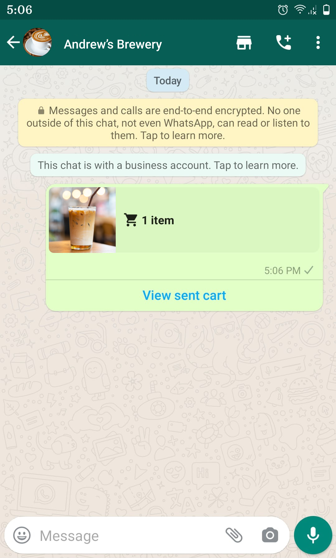
The Problem
Users cannot access Chipotle's complete menu on WB. The current WB catalog cannot accommodate Chipotle’s diverse menu offerings and there is no payment feature available for the user.
It is important to Chipotle for its product line to be fully expressed on WB platform and for successful order completion it also needs a way for payments to occur through the platform.
The Goal
Help users complete the core tasks, hence redesign WB catalog to accommodate Chipotle’s menu and add payments feature to complete the order.
Users
Can access Chipotle's main menu
Can access secondary menu
Can order “Build your own” dish
Can order “pre-configured” dish
Can see their Reward Points
Can pay
WB Platform
Yes
No
No
Yes
No
No
Actionables
Following pointers are the actionables for Chat, Catalog and Payments flows
Add access to marketing/promotions screen
Add access to payment icon
- Add secondary catalog & add “add cart” button to it
- Add “build your own dish” & add “add cart” button to it
Add Payment UI to complete the transaction
Order confirmation message from Pepper
Existing User Flow
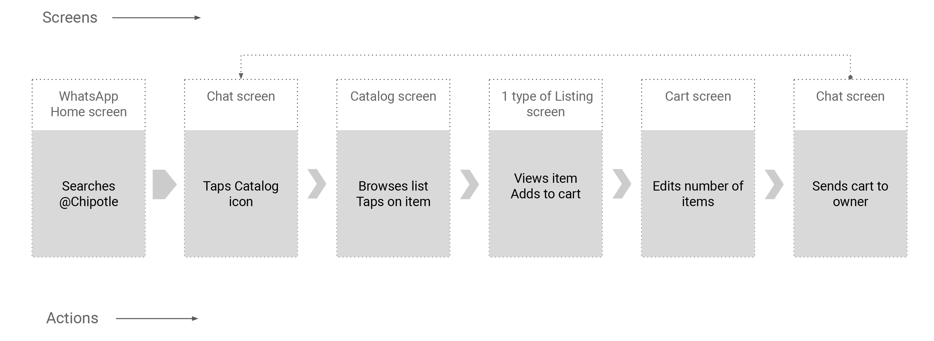
Proposed User Flow
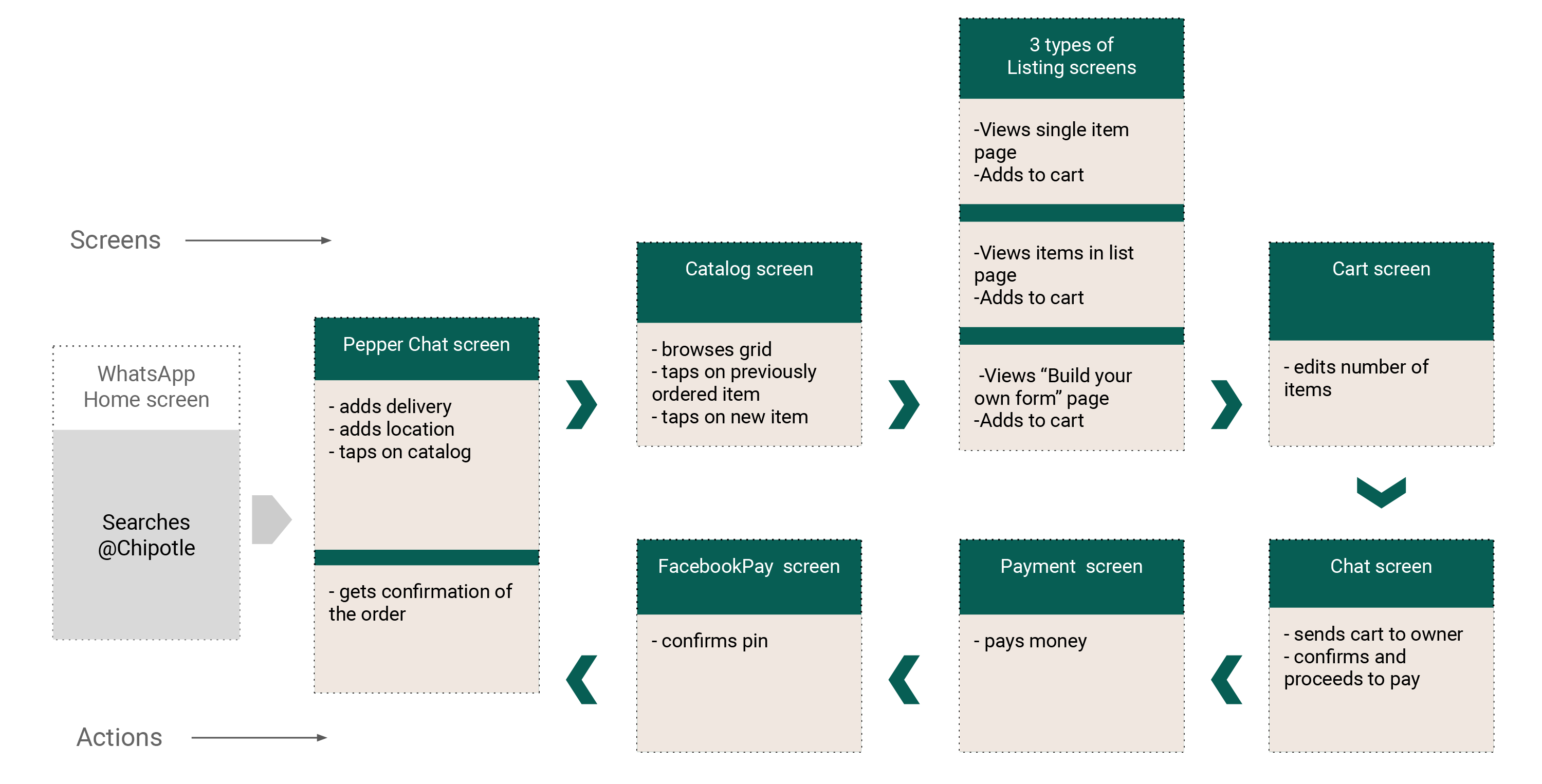
Wireframes
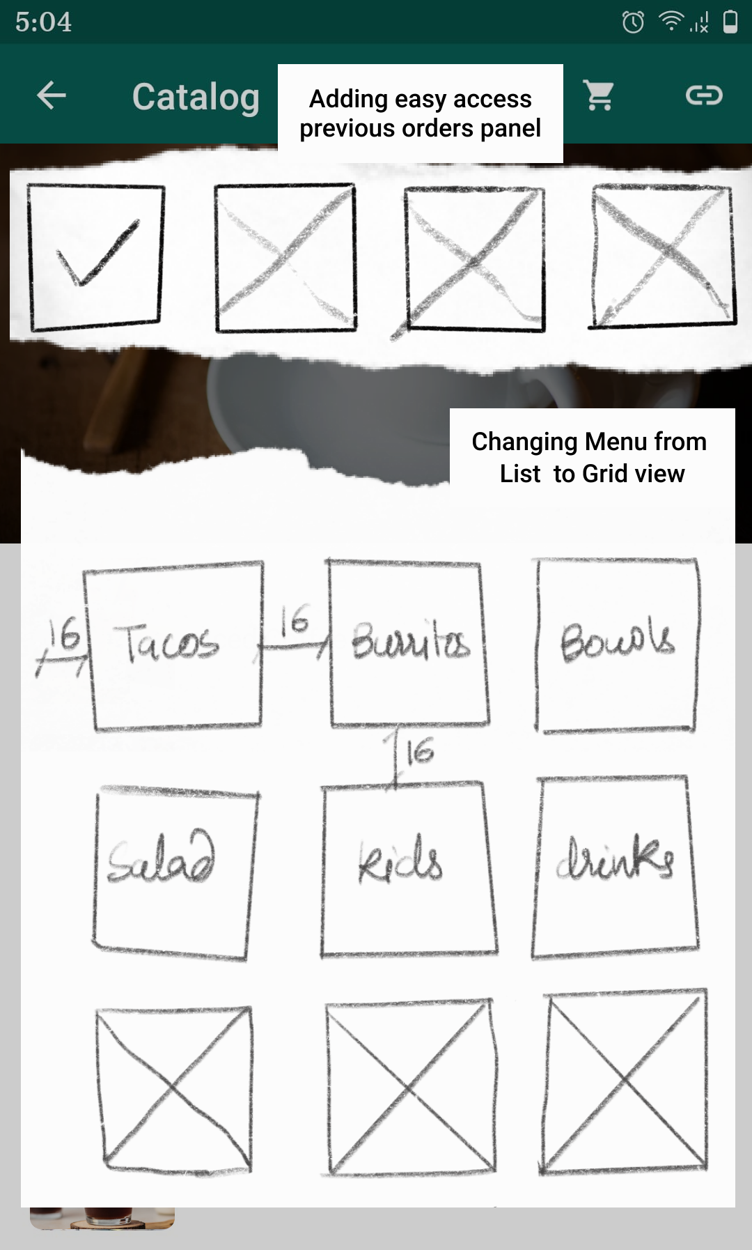
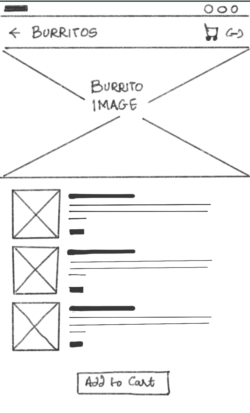
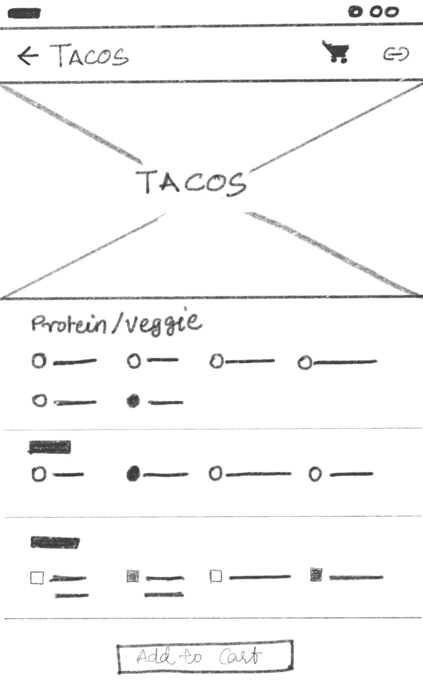
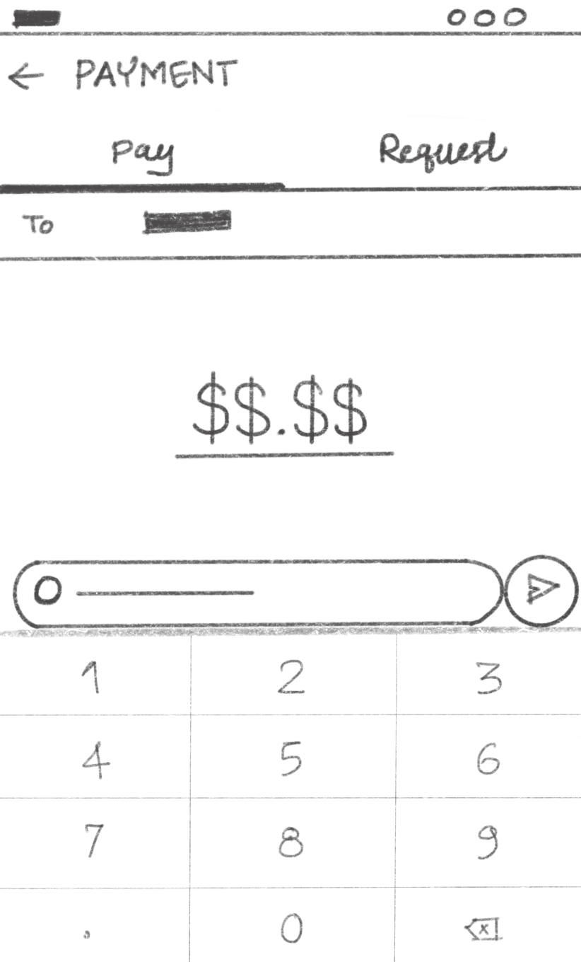
Wireframing started with sketching possible changes in the existing UI and adding new screens to the user flows
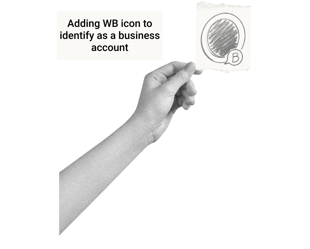
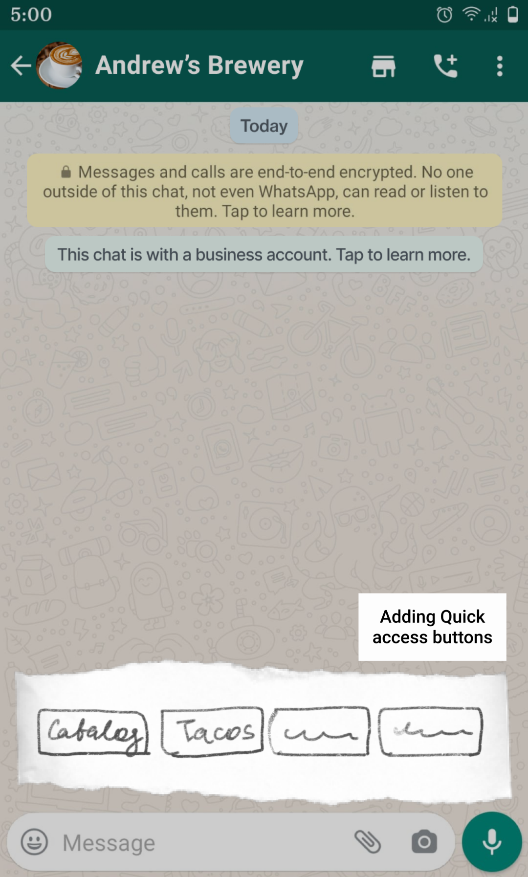
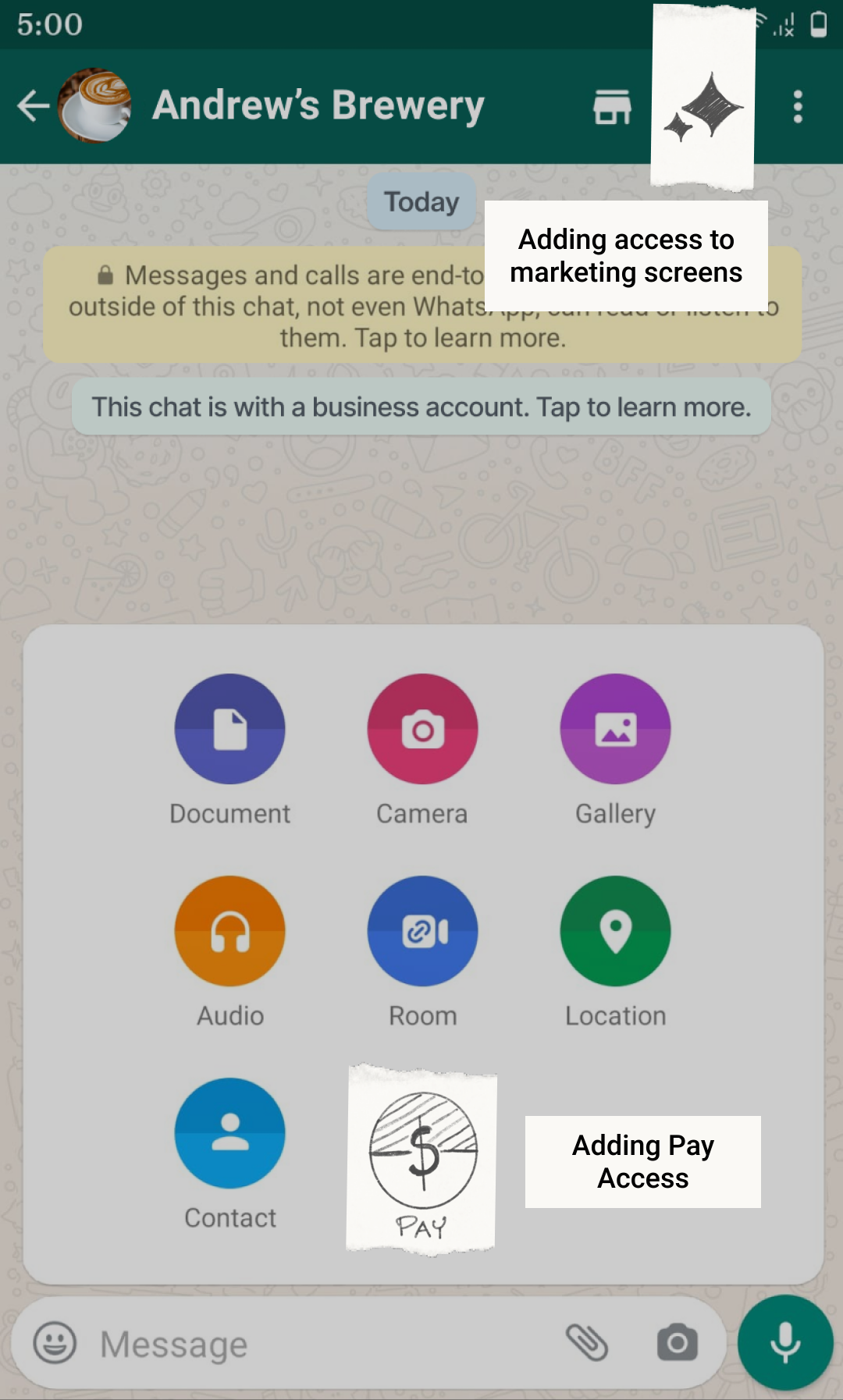

Hi-fidelity Mockups
(Hover mouse over to enlarge the image)
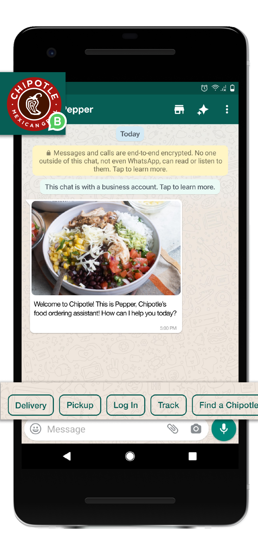
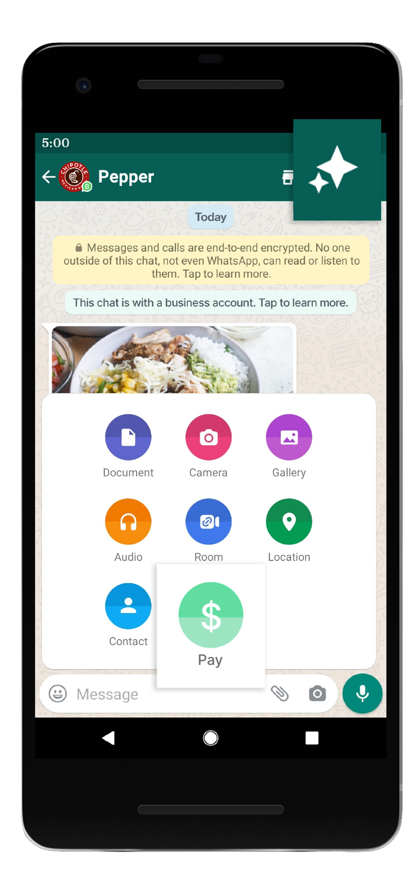
Chat
- WB icon for business accounts
- Quick access buttons
- Promotional screens access
- Pay acess
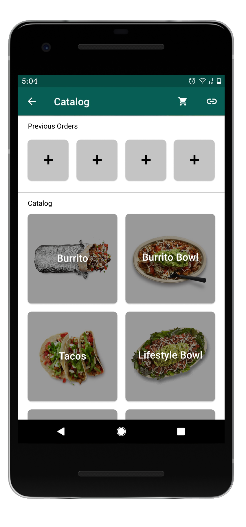
Catalog
- Previous orders panel
- Main categories grid
- Cart access
Ready to go dish menu
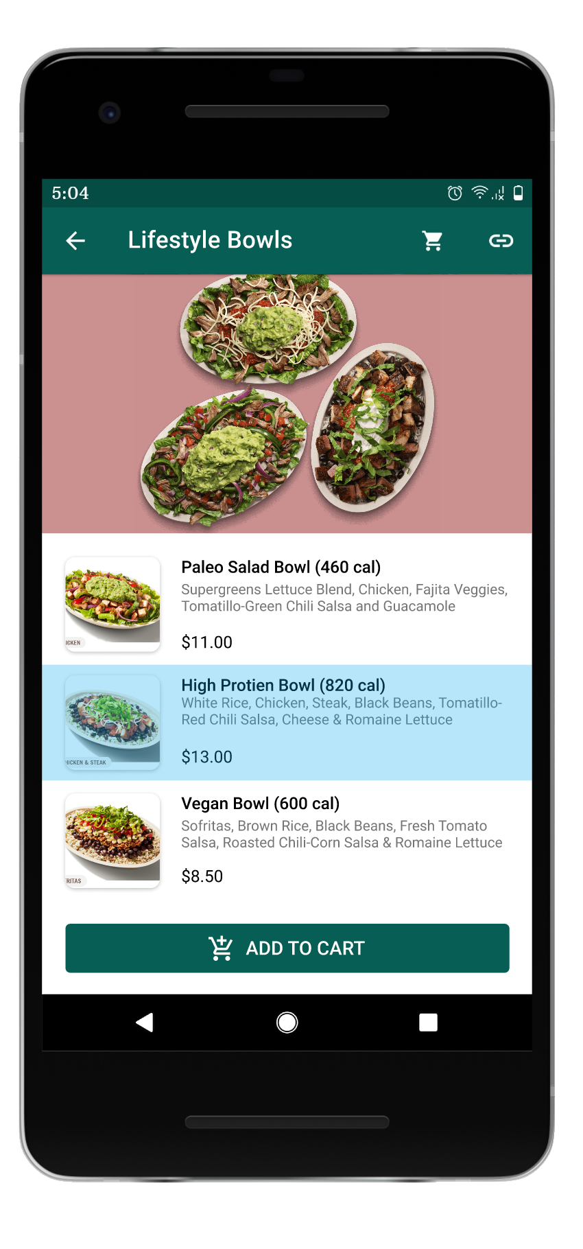
- Secondary menu list view
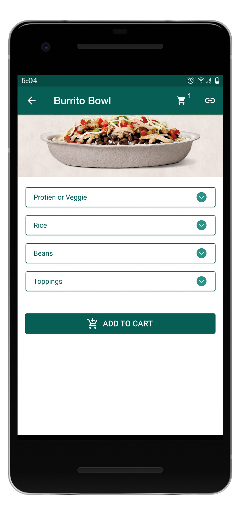
- Multi select
- Add to cart Button
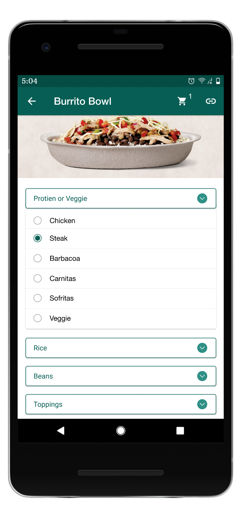
Build your own dish menu
- Expansion panels
- Radio butons & check boxes
- Add to cart Button
Cart
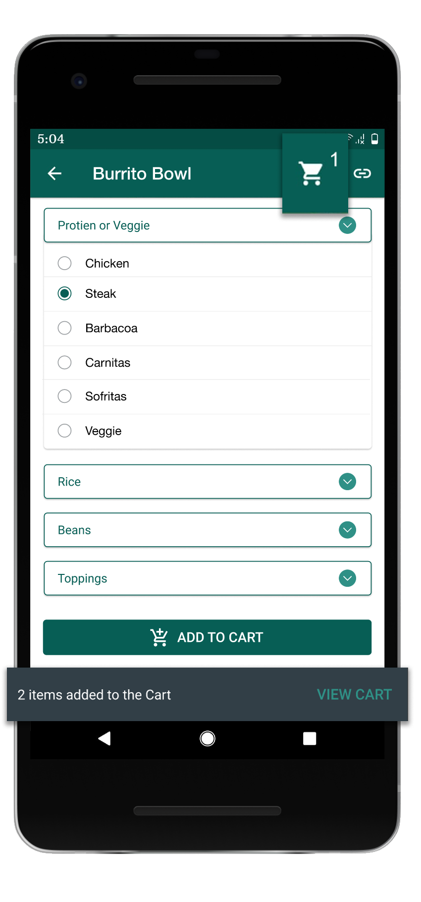
- Icon & Snack bar
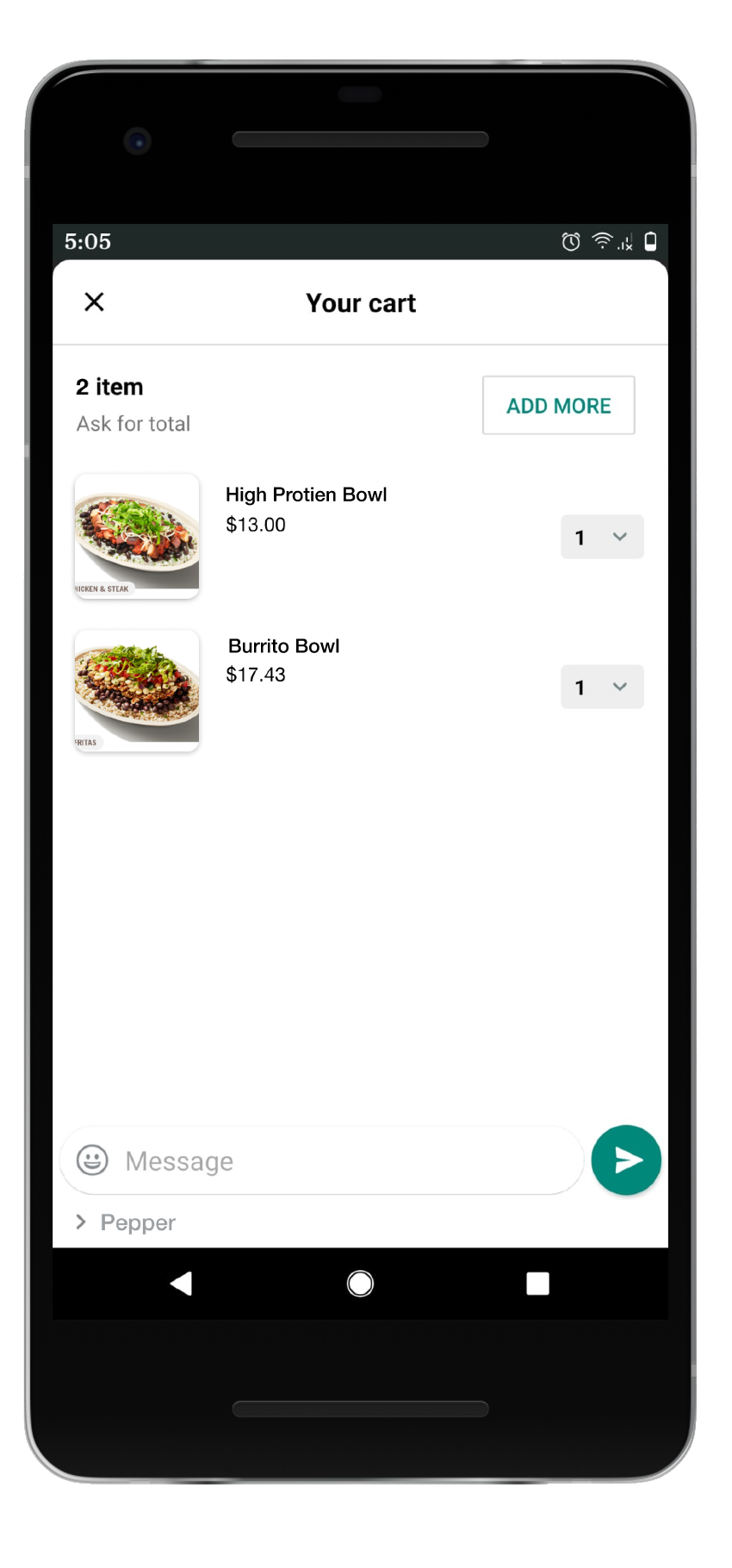
- Screen with Send button
- Cart sent to Pepper
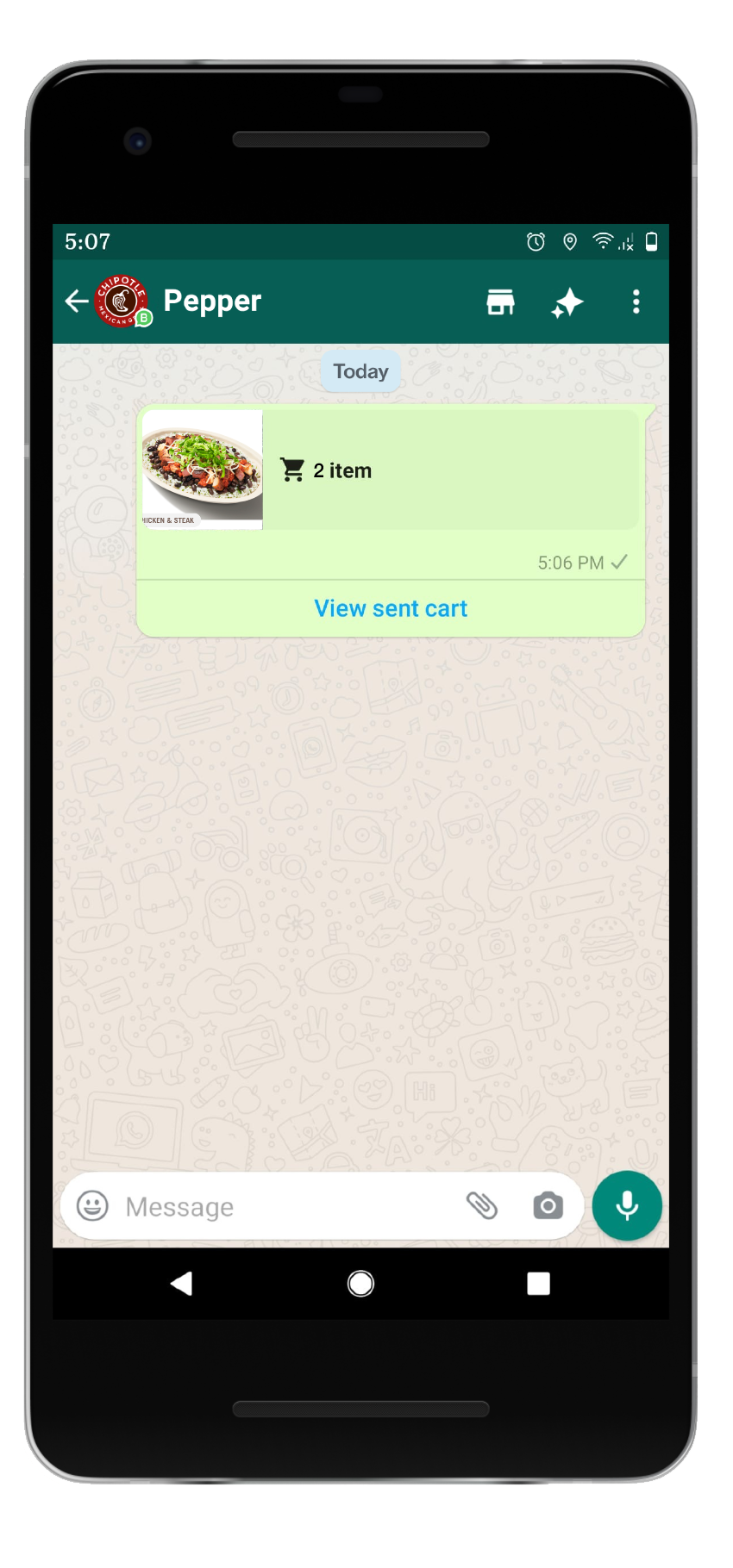
Payments
- Pay/Request
- Facebook Pay integrated
- Confirmation Pin security
Payments Confirmation
- Payment sent in chat
- Order confirmation
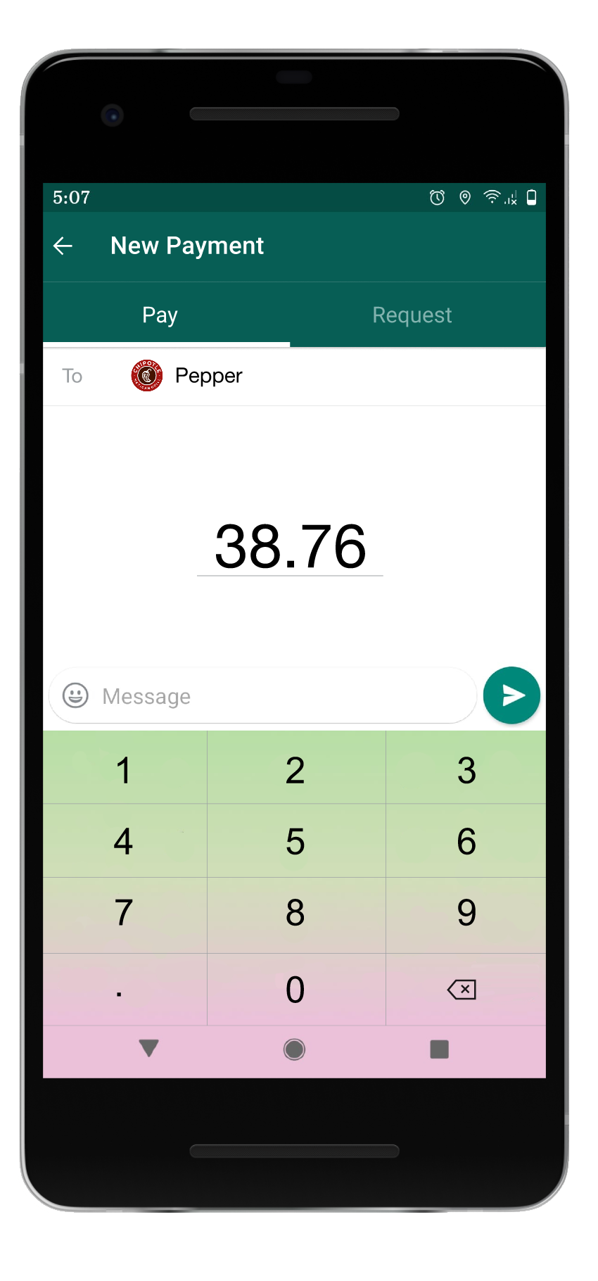
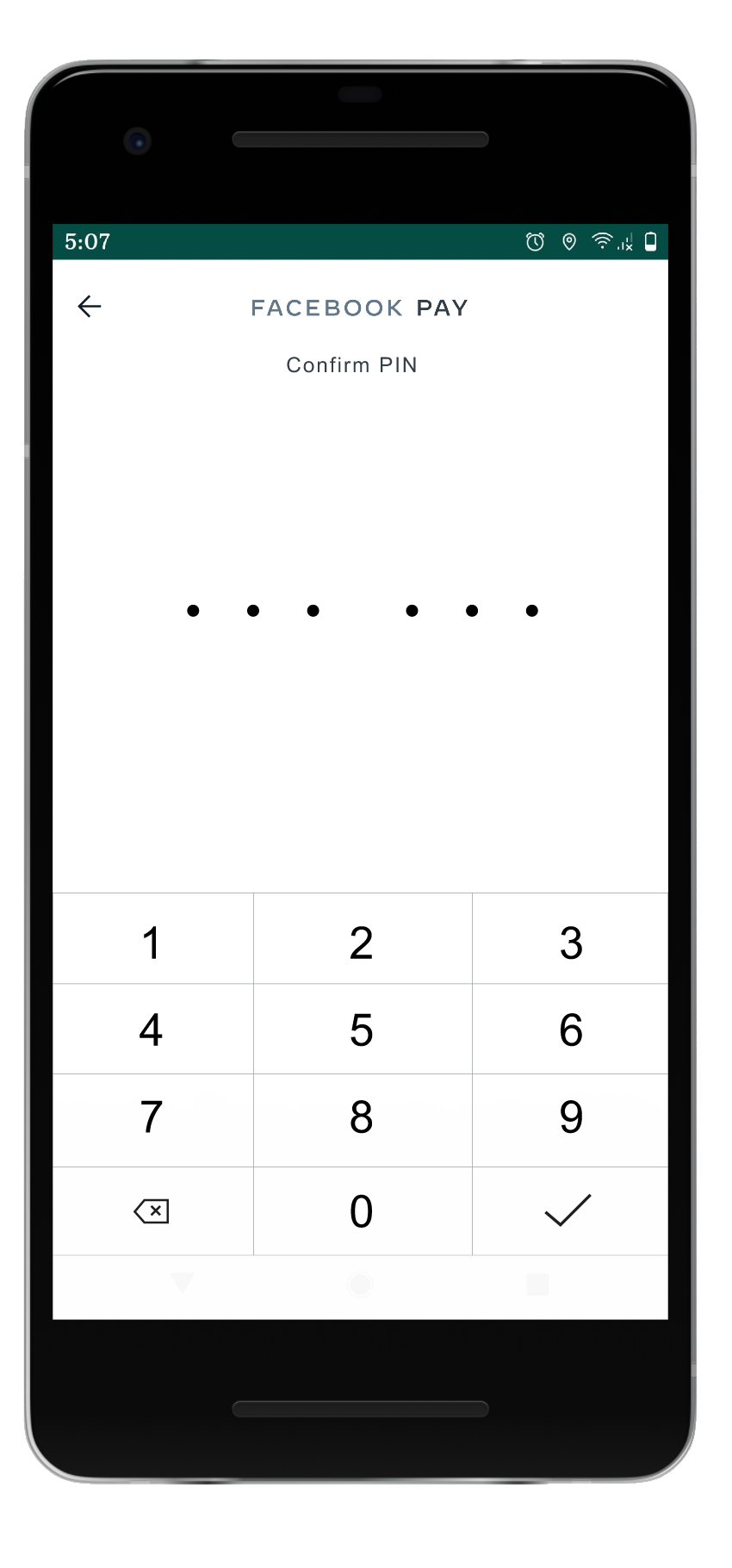
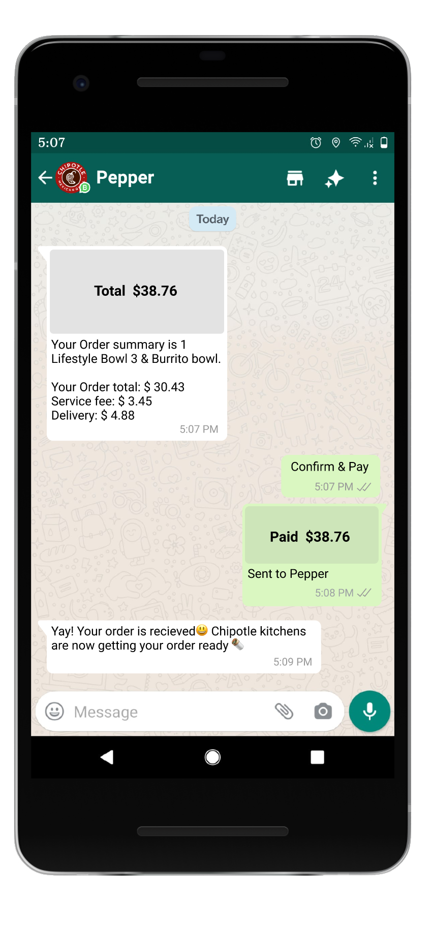
Users testing

V, 42, Student/Part time Job
WhatsApp: Infrequent
Chipotle: Once a week
Context: Afternoon lunch

Y, 26, Mechanical Engineer
WhatsApp: Daily
Chipotle: Bi-weekly
Context: Orders after evening gym
Usability test
Moderated remotely, 30 min video call with Maze link.
The users were given tasks to undertake & were asked follow-ups questions. They were also gifted a Chipotle gift card at the end.
Users
I recruited 5 participants for this test. All of them have different usage of WhatsApp and different frequency of ordering from Chipotle.
User pain points & Actions
The overall flow was easily understood and navigated by the users, we observed some of the confusions faced by users in the tactile experience. Some of the insights are shared below
Insight : 3/5 users were searching for a “proceed to checkout” button. Sending the cart to the business owner in a message format was a new form of interaction.
Before : Removing text box and small send button since it was counterintuitive to users
After : Adding a big “Send to Pepper” button to keep the UI clear & intuitive
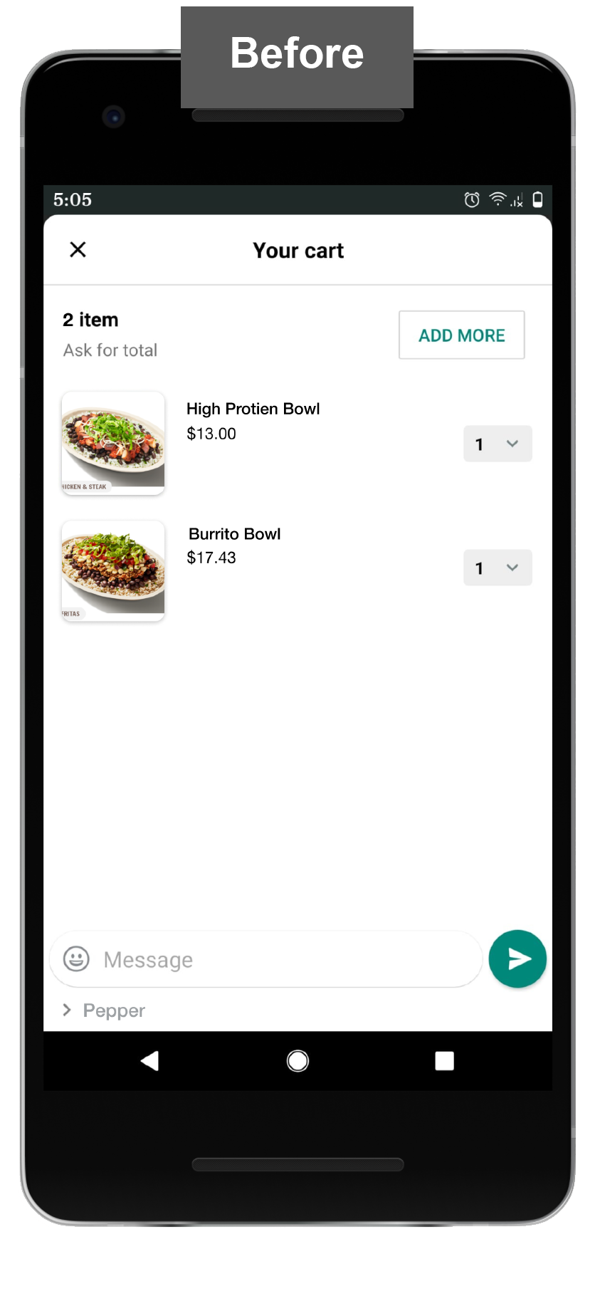
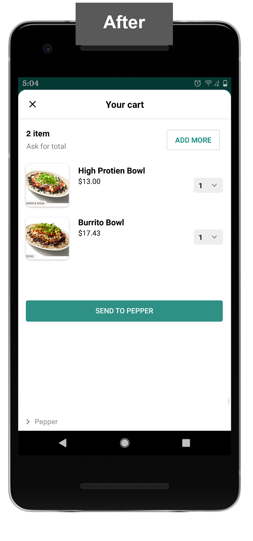
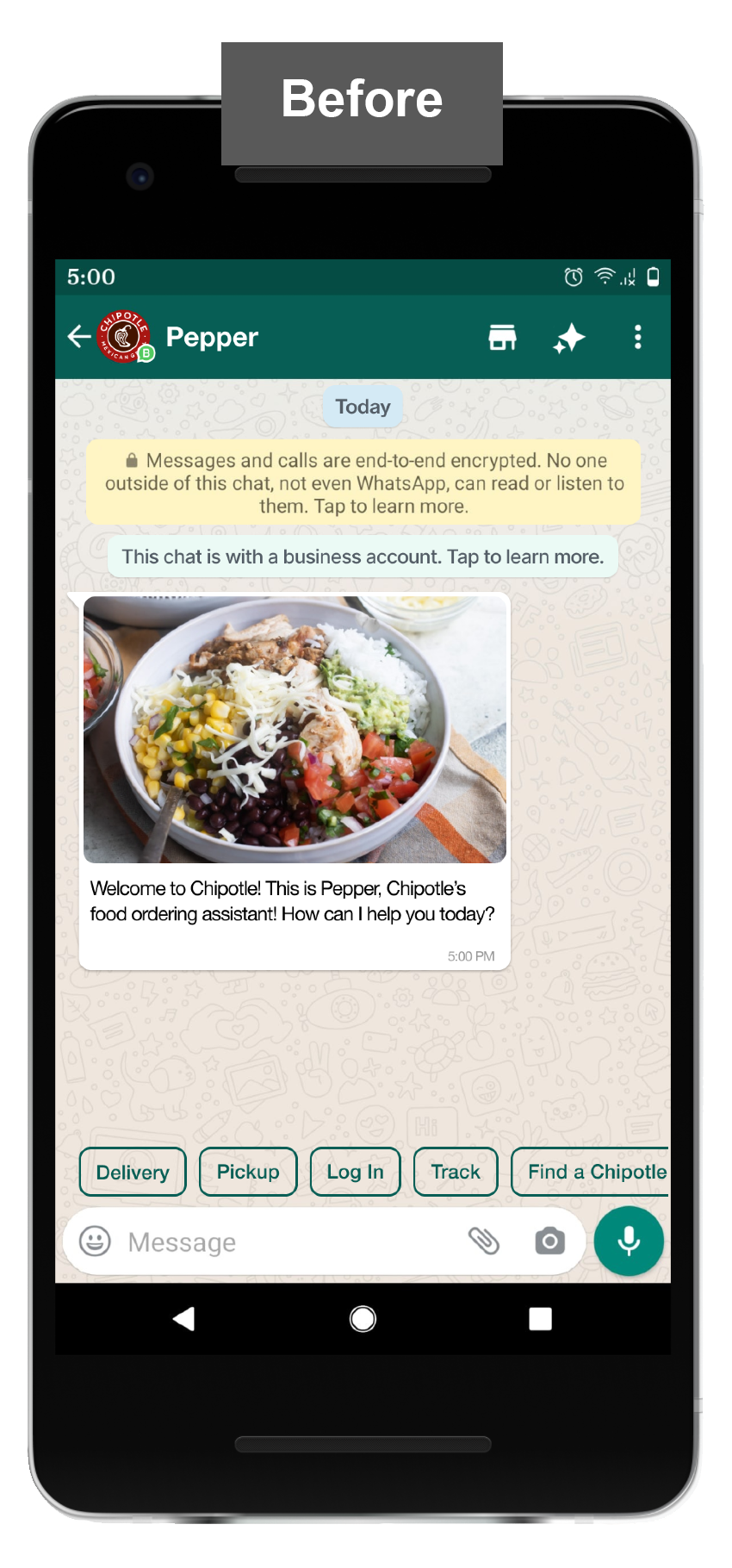
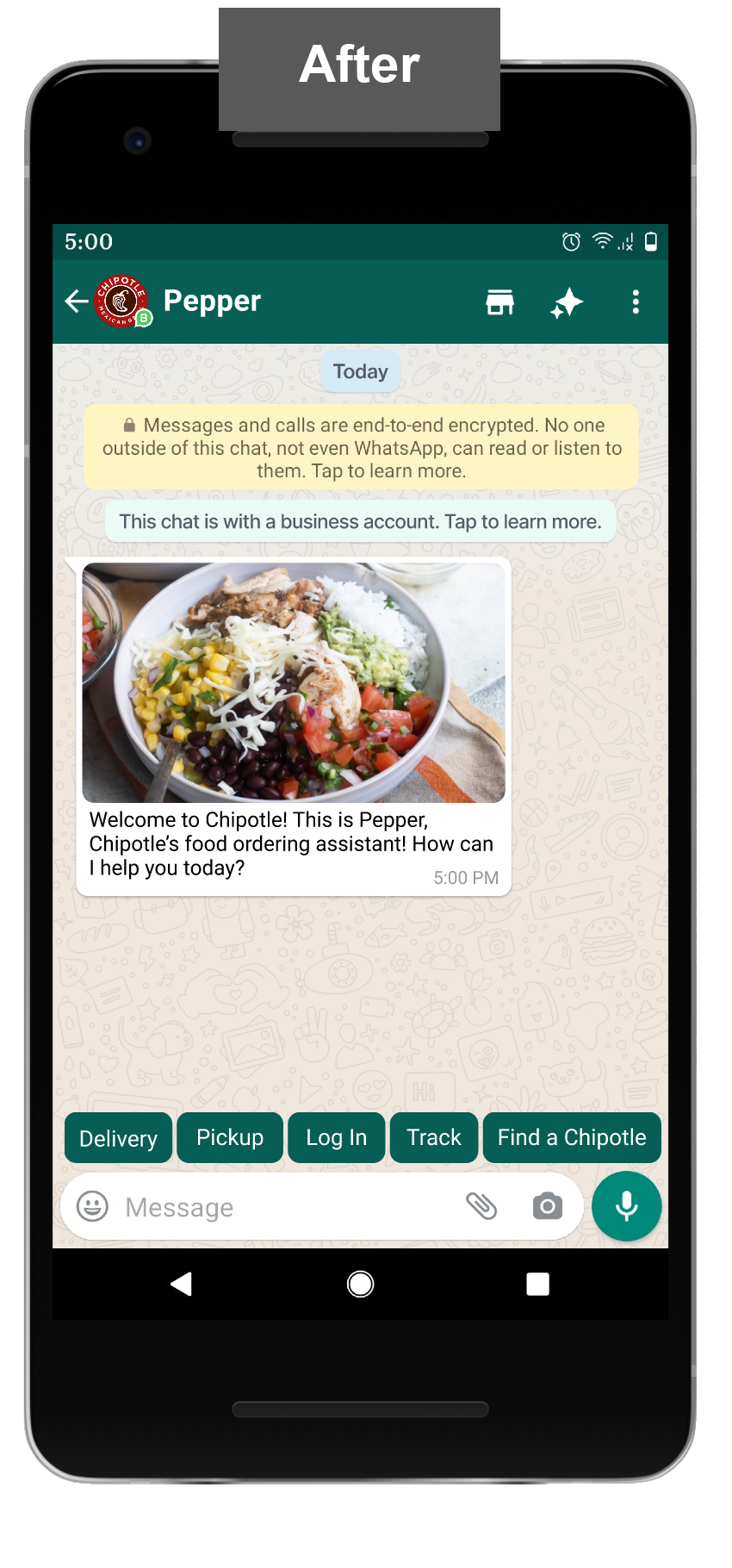
Insight : 5/5 users found the quick access buttons very useful. Though there were confusion about the legibility of the buttons
Before : Quick access buttons were not filled, creating difficulty to read
After : Quick access buttons filled to create more contrast for easy legibilty
Such many insights were observed and corrected per the user testing. they have been incorporated in the final design.
Final Product Video
Takeaways


TrellisContract project • App design • Product design

Anew VistaWebsite Redesign • Volunteer project
HostEasyContract project • Web redesign • Product strategy
Thank you for visting and let's get in touch.
Find me on LinkedIn or shoot me an Email at samlele27@gmail.com
Designed by Sampada Lele

