
Dear Reader
This portfolio project highlights Auditing, Product roadmap, Iterations, Design Decisions, Visual Design, Competitive analysis. Status: Launched
Trellis
Trellis is an AI Reader app that aims to transform multi-modal learning for students and reading enthusiasts. It allows its users to read, listen and talk to their books via an AI assistant "Celeste"
Product designer / Contract / Oct 2023 - Dec 2023 / Collaborated with the Founder, Senior designer and 2 Full stack engineers
Challenge: Extending web app functionalities in an inaugral iOS app.
Trellis, unveiled its webapp in early 2023 with an operational MVP. The platform allowed readers to seamlessly upload books/PDFs, curate collections, and personalize their digital libraries.
Readers could engage in reading, listening, and chat with Celeste, the AI assistant, enhancing their understanding of various subjects. With the success of it's web experience, Trellis's founder envisioned extending these functionalities to readers through Trellis's app. However, even with the preliminary user flows sketched out, Trellis app was far from the vision the founder shared.

Product road map
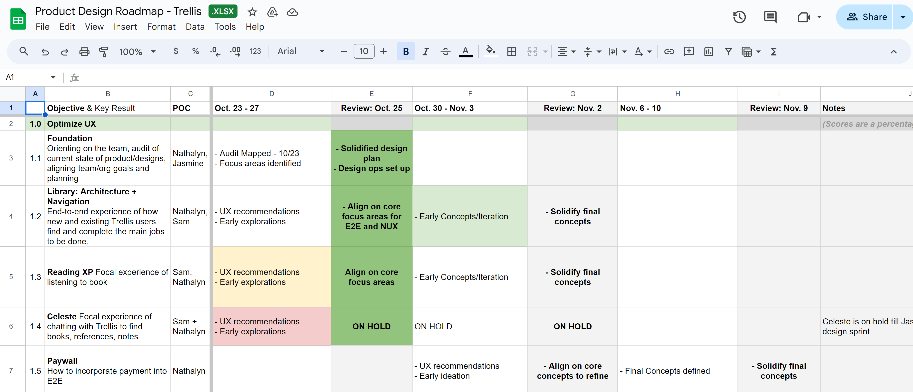
Between myself and the senior deigner we maintained a Google sheet, that was our go-to, evolving Product road map document. After any important changes would be updated in this document, we would take a timely review and track our tasks.
I attended daily stand-ups with the team, informing the tasks we undertook yesterday. Every alternate day, we had design sessions, design reviews to take feedback from the founder and weekly team share-outs with the engineers.
Let's priortize!
We wanted to use our limited time effectively and prioritization was the way forward. After aligning with the Founder, we were tasked with desiging the central userflows.
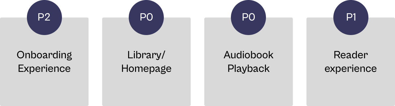
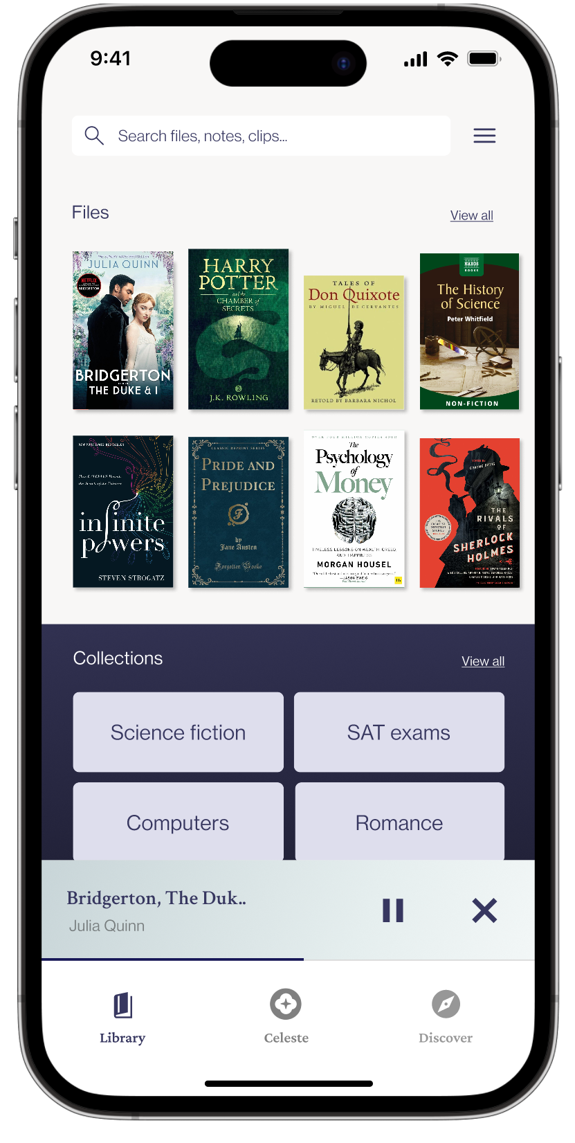
P0.1. Library ( a.k.a the homepage) including the empty state. This was the first and the most central experience of the user journey which then led to an audio book playback.
P0.2. Audiobook playback was an already existing functional feature which then led to reader page. After tackling these challenges, if time of the contract suffices, we would concentrate on the onboarding experience.
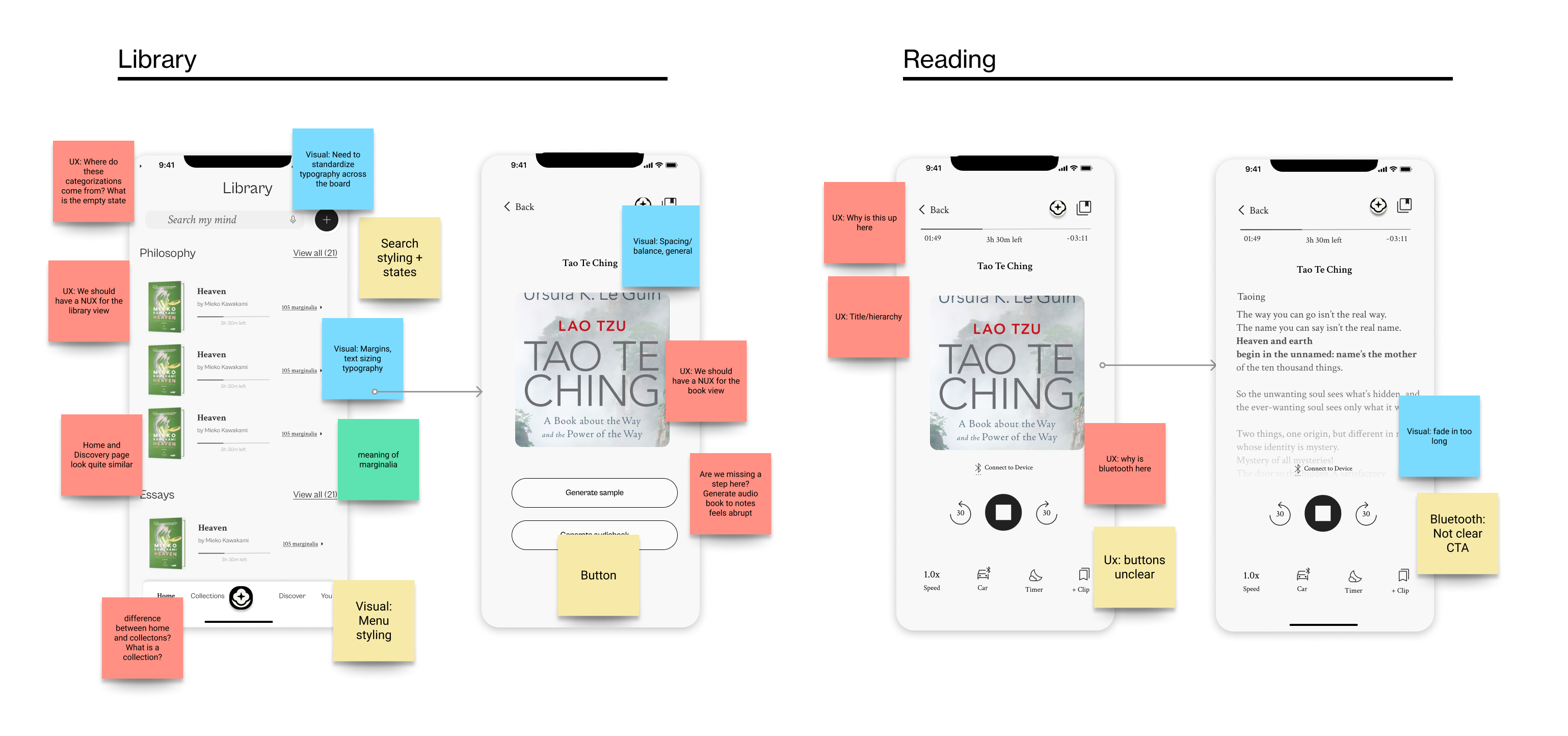
First, peeling the layers with an Audit
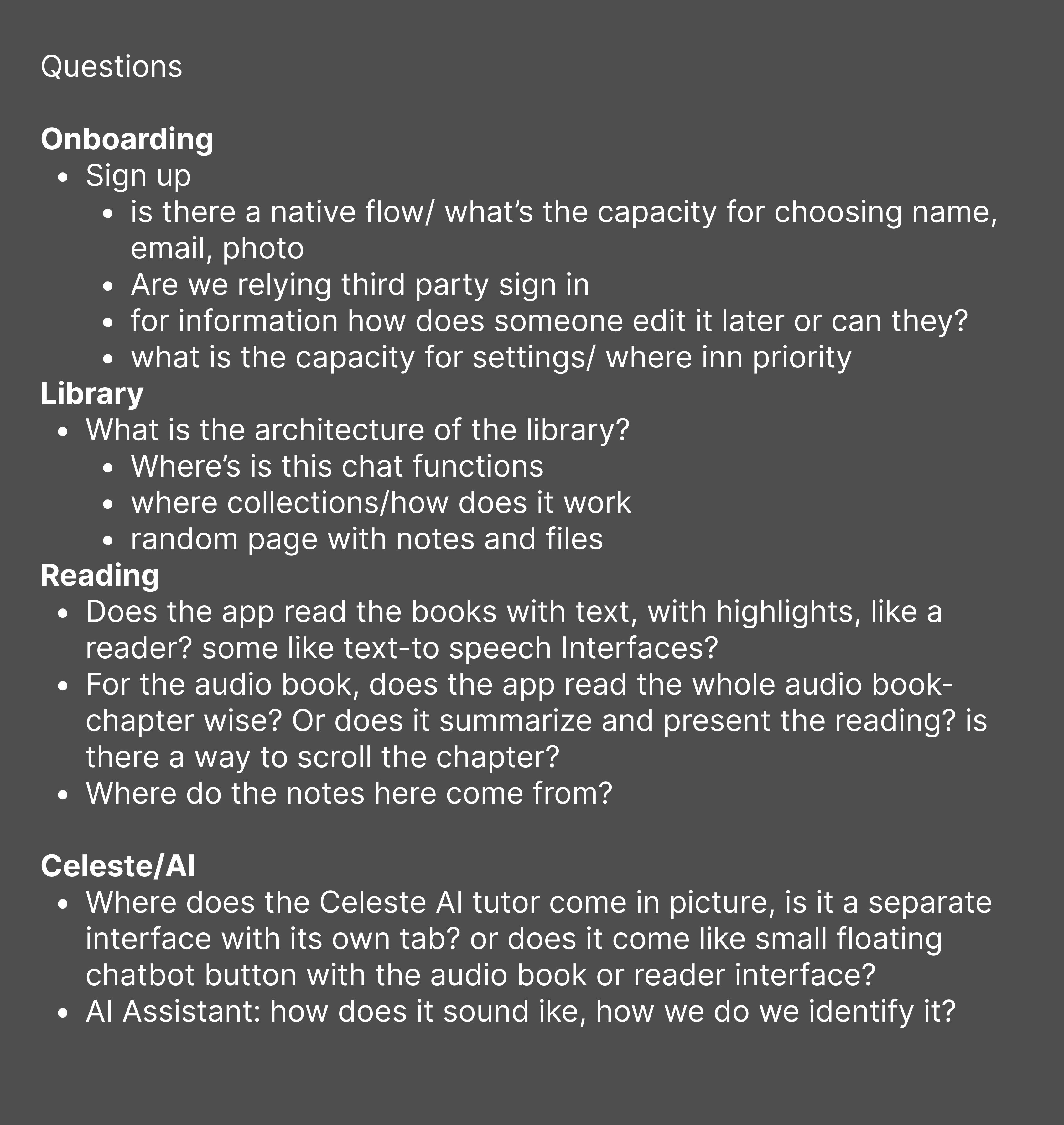
A fresh audit was the first step to identify gaps and decipher our direction. The Audit consisted of 2-3 workshopping sessions between me and the senior designer, where we would start noting down our questions and comments.
This exercise allowed us to dive deep and ask questions based on UX, Visual, Content and Interaction.
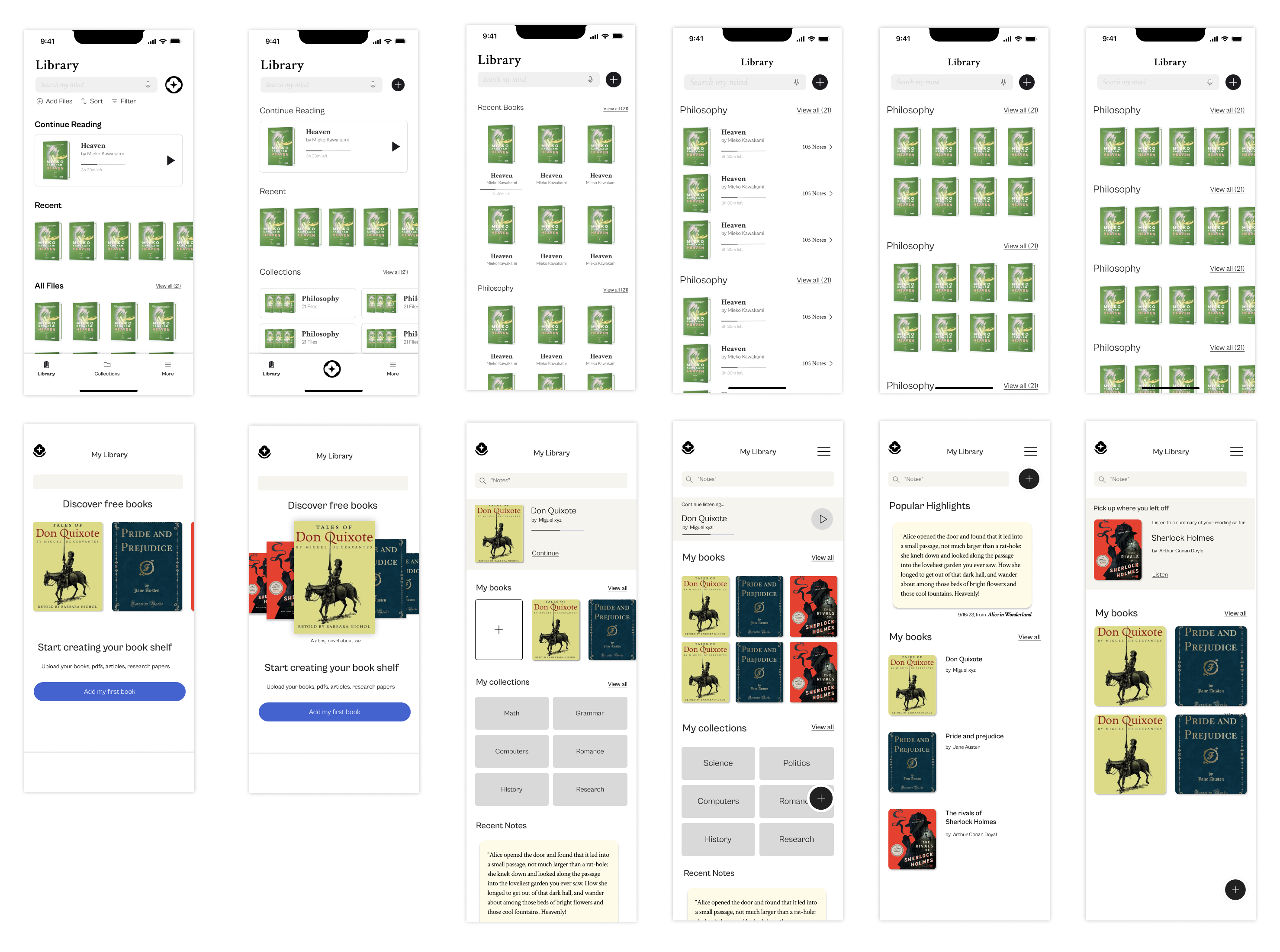
Iterations galore for Library
We tackled iterations in 2 ways
1. Since we were dealing with a lot of book tiles, one set of iterations focused on multiple visual permutations of Books stacks- vertical, horizontal, grouped, listed, etc. This helped us design with non-overwhelming layout for users.
2. Second approach was to incorporate these layouts to create user freindly - mixed panels. Typical mixed panel page had
- Latest read book
- Overview of user's files/books
- Collecton stacks
- Notes
After iterating, we solidified on concepts for mixed panels which led way to the final wireframe.
Design decisions for Library (Homepage)
Unread mails and user pyschology
Unread mails notification can cause anxiety to the some users, similarly, the idea of sliders displaying half read books can stir discouragement for the readers. As a solution, we included only the most recent audiobook uptop with a bar denoting the amount of the book read. This would help the reader to pick up where they left.
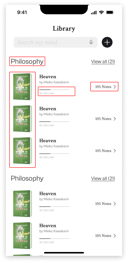
Removing redundancy
Since Notes CTA from the previous version was a secondary action hence we proposed removing it.
Inital wireframe
Final wireframe
Mixed grid for visual variation
Files section gives the reader an overview of their books and the mixed grid creates visual variation amongst the books for easy identification, compared to the previous version, which had longer scroll and roster like files sections.
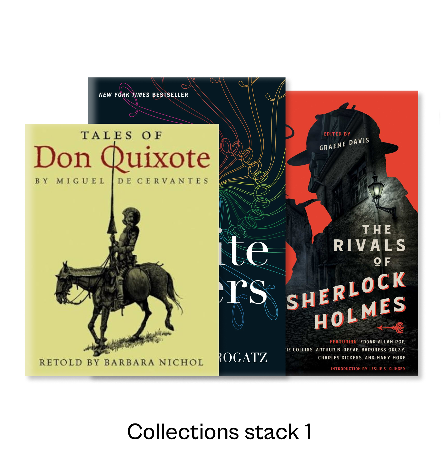
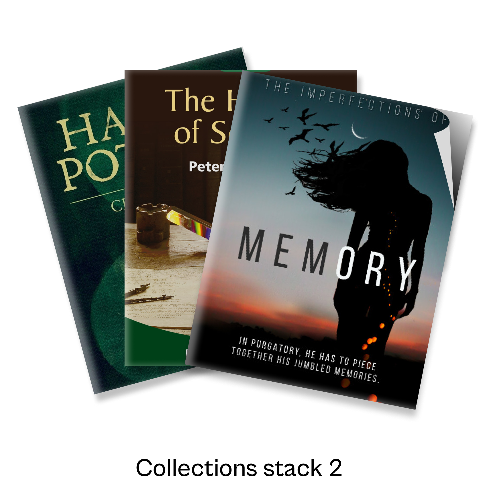
Collections Stack
For easy filtering and retrieveing of books, we included a Collections section.
Iterations galore for Audiobook Playback
"Book covers are rich in colors. Books like Art, that's my vision"
The Founder's vision was to showcase the books like art on the museum walls, welcoming the reader into the world of the author. This poetic vision instantly sparked some ideas for us, we headed on to our Figma to play with colors, gradients and shadows.
Our exploration involved sampling various gradient styles, blending monotones and duotones. We selected diverse books with darker and brighter shades to refine our wireframing experiments, ultimately settling on a definitive duotone gradient. This gradient featured highlights at the top transitioning to shadows towards the bottom, creating a visually dynamic effect, capturing the beauty of the book cover colors.
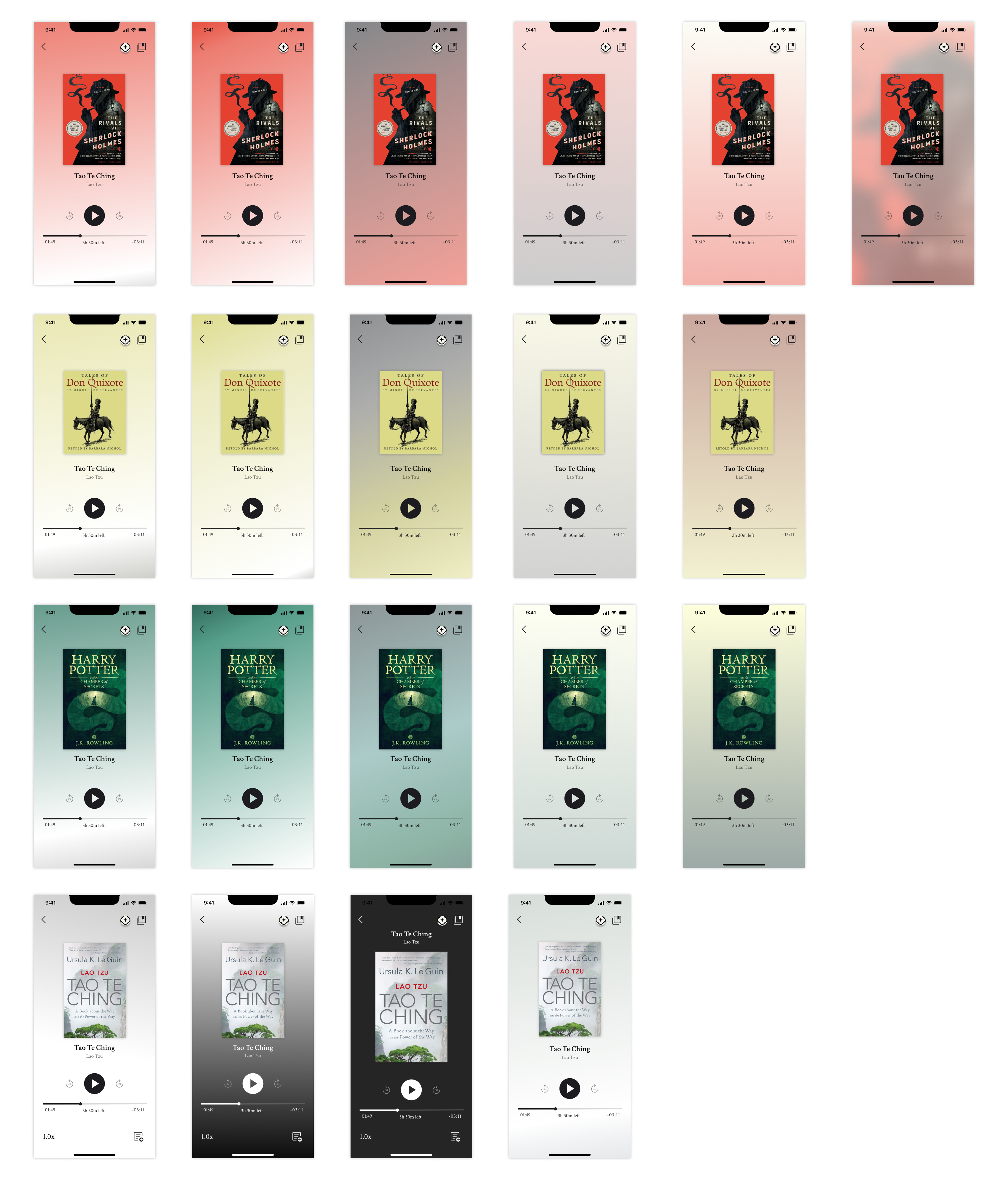
Finalized duotone gradient
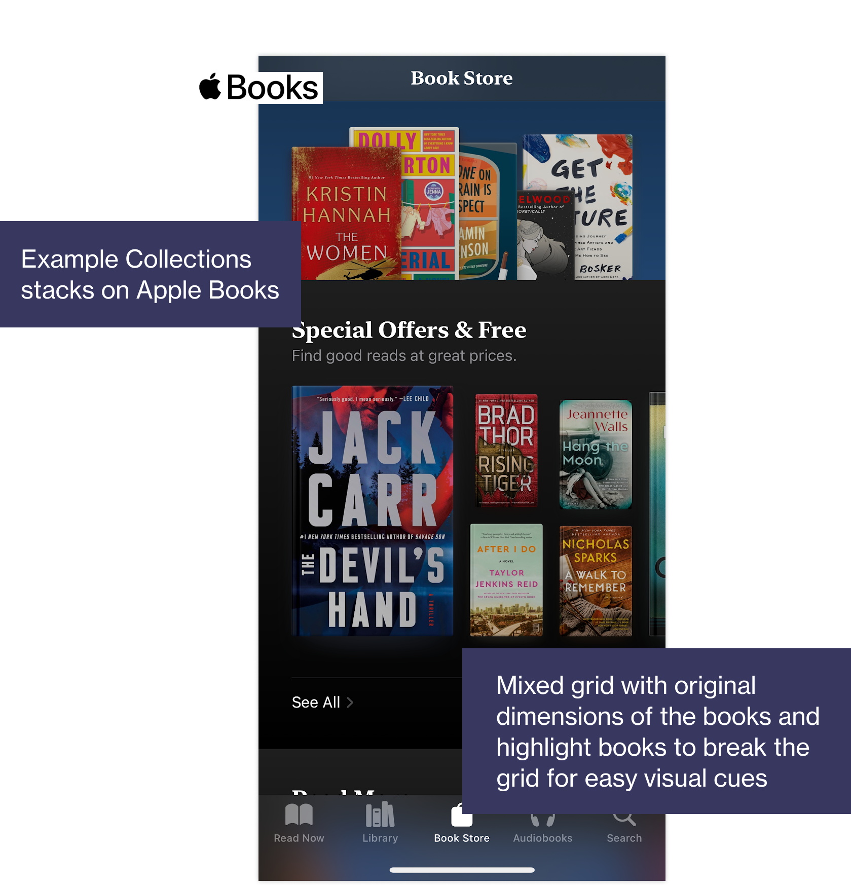
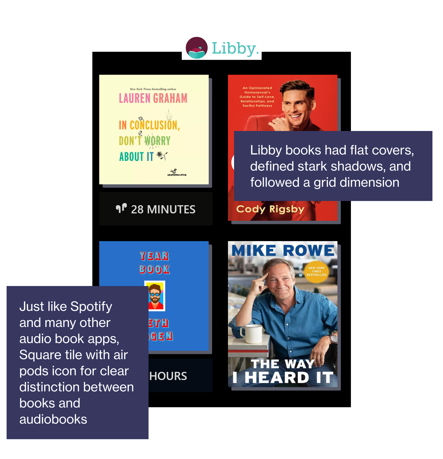
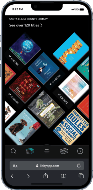
Analyzing Apple Books and Libby
We undertook competitive visual analysis with 2 reader apps - Apple books and Libby. This was specially a fruitful excersize since we collected information about designing grids, creating visual variation, consistency in book tiles, interesting interaction patterns, etc.
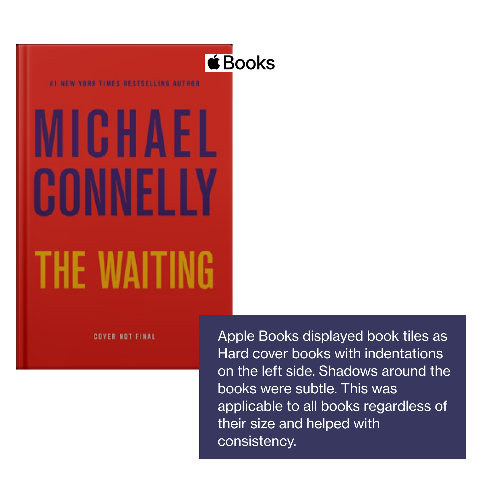
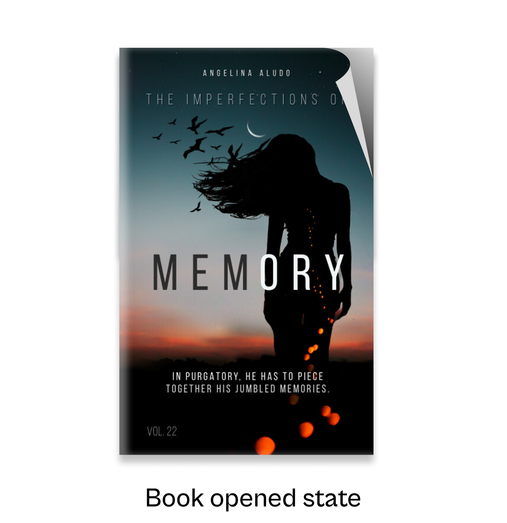
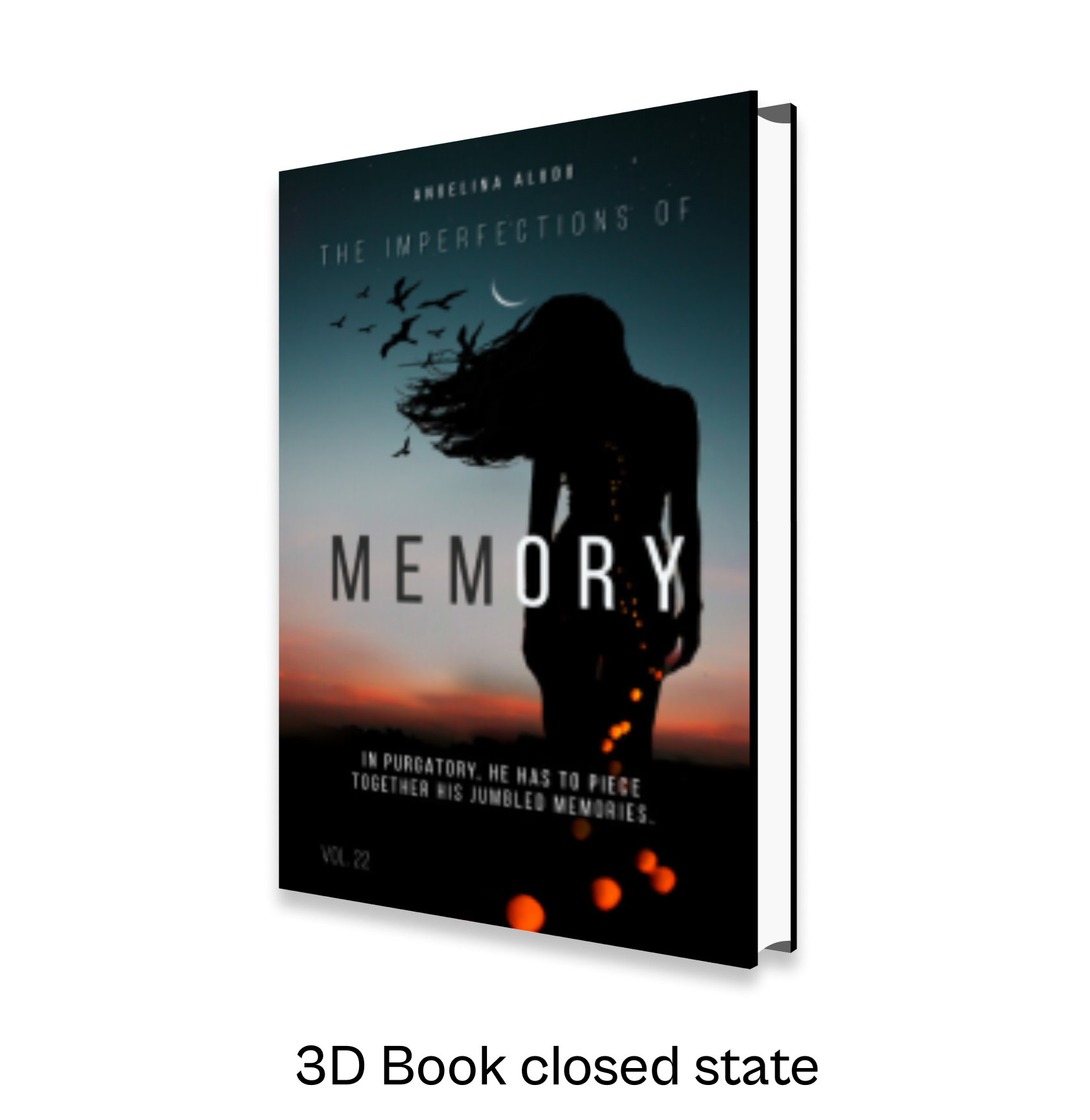
Visual design for Book tiles
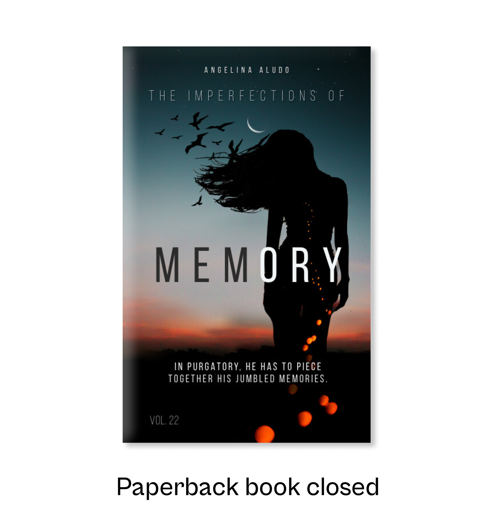
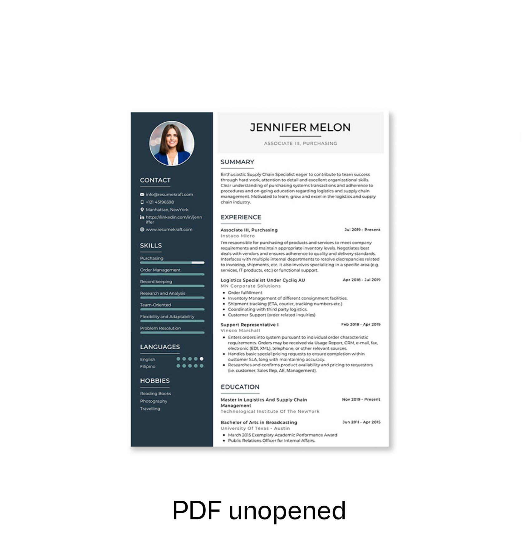
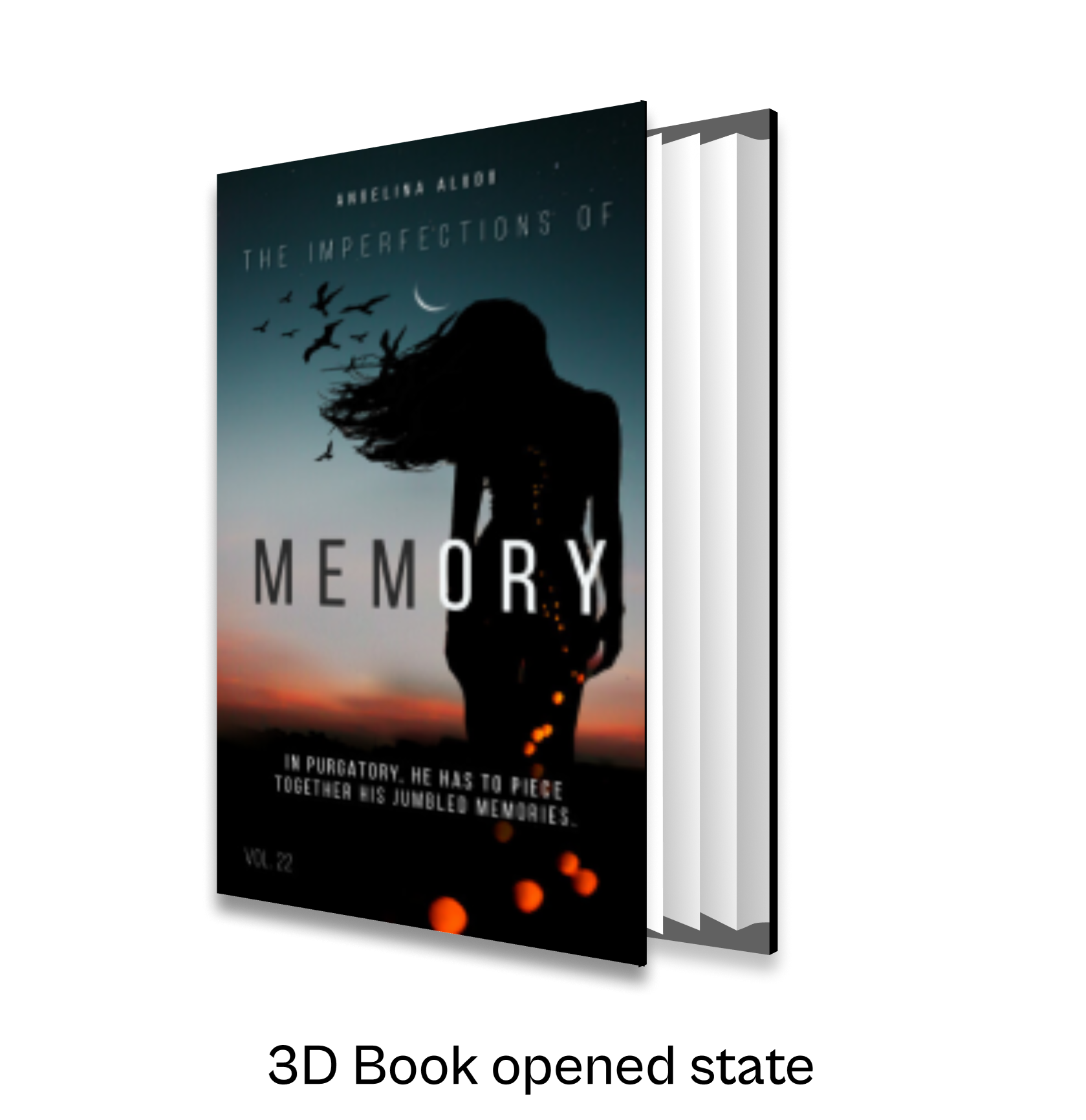
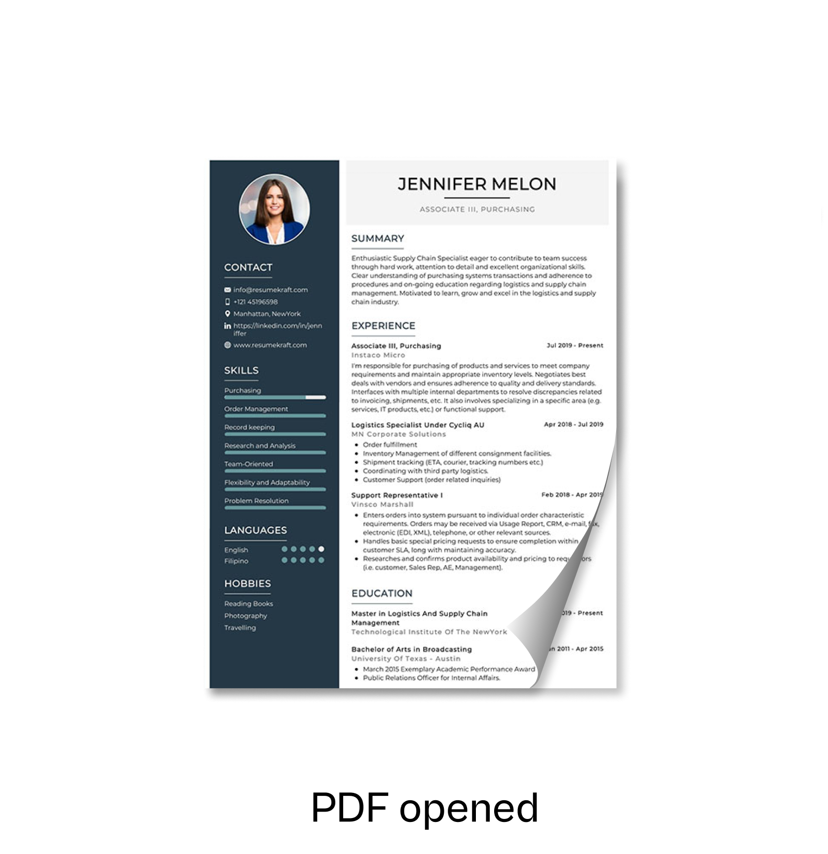
We embarked on a rapid exploration to enhance the presentation of book tiles for our readers. Our aim was to make book tiles more than just images. We wanted them to convey the book's state whether it's open, unopened, part of a collection stack, or even rendered in 3D. After consulting with engineers for expedited development, we concluded that the default state would be a closed paperback. However, we recognized the potential for incorporating various states as future options.
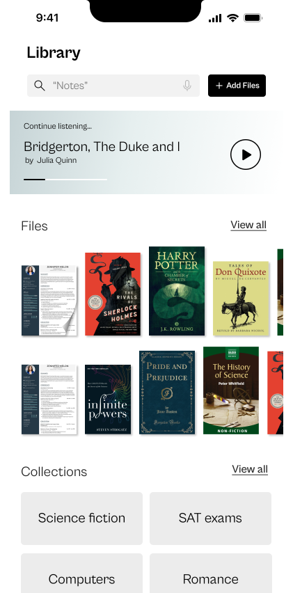
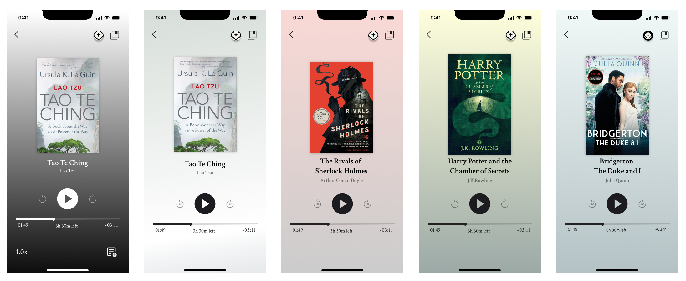
Final result
As we headed towards the end of the contract, we were happy to have delivered on our scope within the timeframe. These deliverables were implemented by the engineers on the TestFlight app first. And we were glad to see that our screens were also included on the landing page of readtrellis.com website as their marketing graphics.
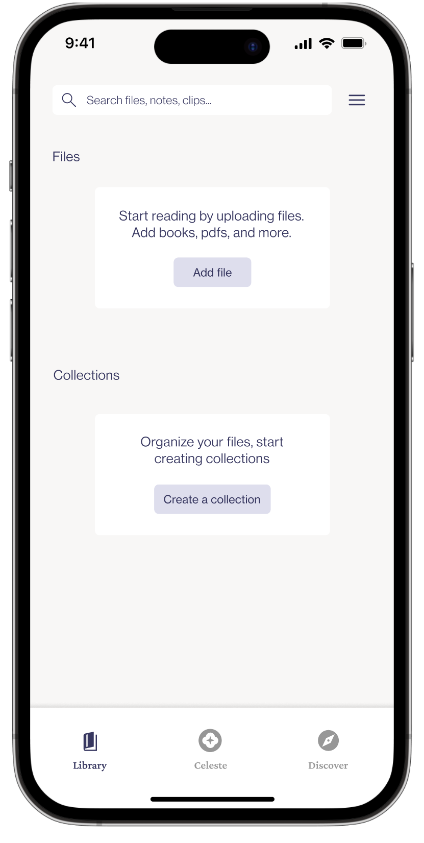
Empty state /NUX screen with Files and Collection CTA
Library screen with Files & Collections
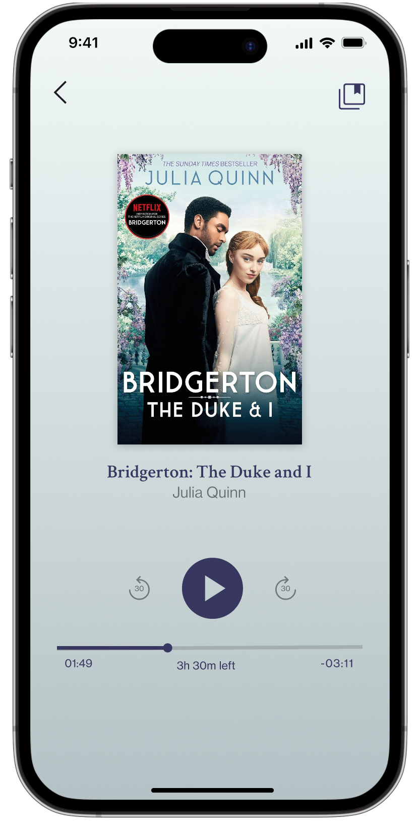
Audio playback screen with duotone gradient background
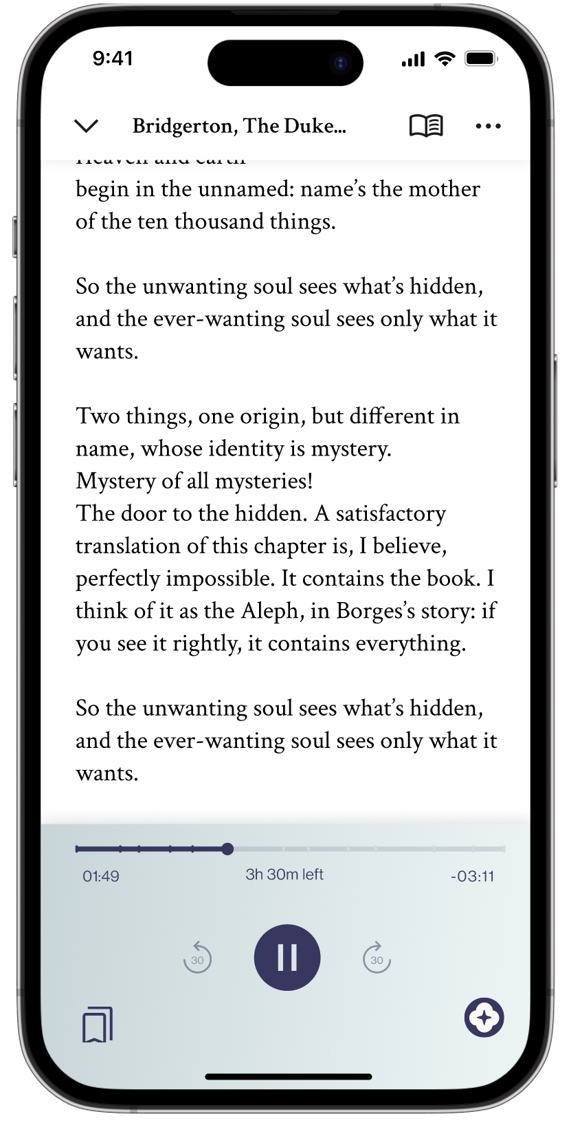
Active Reader screen with primary controls drawer
Things that went right
This was a very fast paced project with rapid development
1. Product road map was golden. With a fast paced project, Product roadmap document served as the anchor- to track changes, divide work and meet goals timely.
2. Collaboration begets clarity. To avoid any techinal thrash, involving engineers early on saved time and effort and the collaboration gave me clarity.
For future
Given more time..
1. Work on refining UI. I would spend more time developing typography and iconography. There is lot of scope for motion and animation in this project, I would like to explore those directions too.
2. User validation. The next step that I would take is to validate the designs with a user interviews to collect qualitative and quantative data.
Anew VistaWebsite Redesign • Volunteer project
HostEasyContract project • Web redesign • Product strategy
Thank you for visting and let's get in touch.
Find me on LinkedIn or shoot me an Email at samlele27@gmail.com
Designed by Sampada Lele