Dear Reader
This portfolio project highlights influencing Product strategy, Research, Website integration with PM tool, Trade-offs. Status: Launched
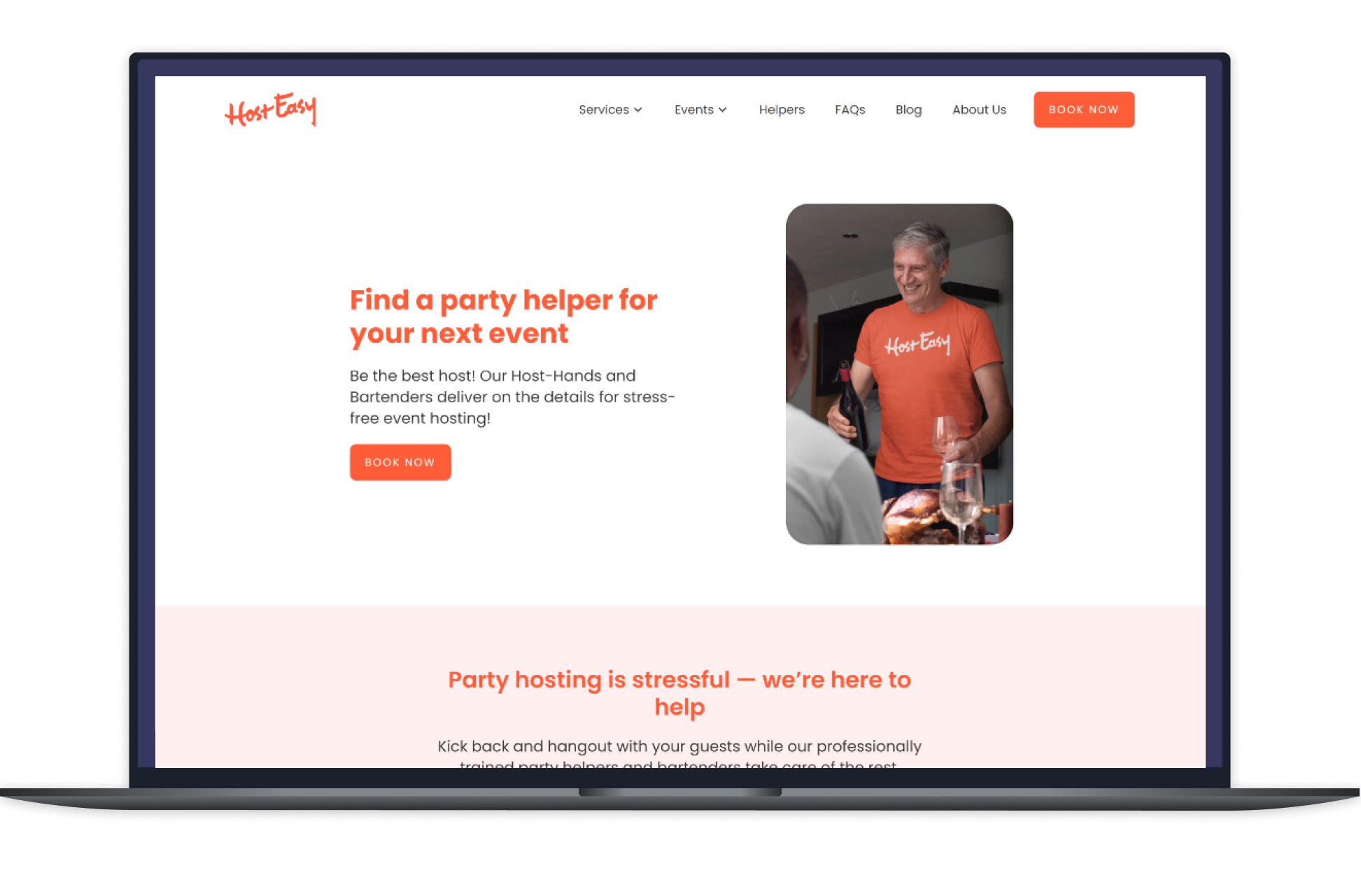
HostEasy
HostEasy, is a marketplace C2C Website + App where hosts can find event help through the website. And helpers and bartenders can find gigs through the app.
Product designer / Contract / Nov 2022 - July 2023 / Collaborated with the Founder, Techinical lead and 1 Front-end engineer
Challenge: Replacing a buggy website
HostEasy website was built in mid 2022, but soon the founder expereinced that it had many bugs and was inconsistent with it's experience for the user as well as the backend side for the admin. I was first consulted for this project to design the App and the website was not in my scope. But as the website was on the point of no return, the founder asked me if I could help them with the website first.
The website being an important customer facing interface, having a functional website shipped and running with a expedited launch time and less build time was critical.
Changing Product Strategy
Adapting to the crisis
After 2 sessions of deep diving with the Founder about the bugs in the current built-from-scratch website, I better understood the struggles founder faced and the loose ends in the process.
The website had 3 parts- Landing page, a form to collect event requests and static pages like FAQ's, Blogs, About us, etc. The website had many bugs like- the critical CTA's would not work, requests would not come through to the backend admin dashboard , the users were not getting a confirmation mail of the request sent, and more.
Understanding the time sensitive nature of this project, I suggested the founder to abandon the website completely and try a low-code, no-code product like Webflow, which can be easily maintained and have a quick turn around and would also be an economically viable option.
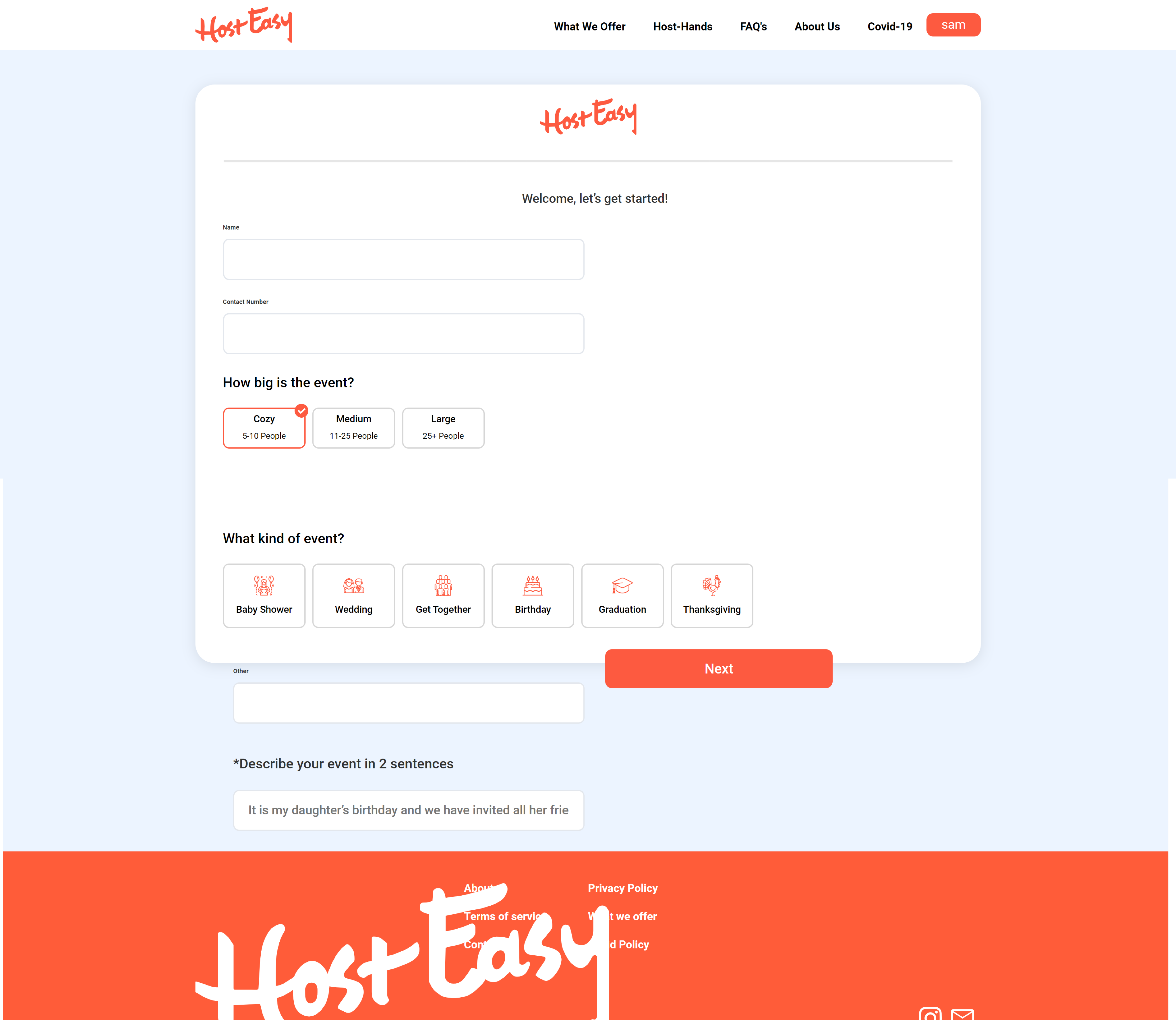
Previous website with bugs and technical issues
Stakeholder Alignment
Sometimes, New is better than a Redo
After suggesting the Webflow option and presenting it's pros and cons, the founder saw this option as a potential fit and aligned with redoing the website through Webflow. With a front-end engineer's positive nod, the Webflow option gained approval and we moved on to the next challenge of Forms.
Research
Form, a bigger challenge tackled
After finalizing the Webflow platform for building the website. The next big piece of the puzzle was the Form.
Website had 3 components - Landing page, Form, and Static pages like FAQ's. Though building a landing page and static pages would be easy, Form was a bigger challenge to tackle. Why was the Form critical?
1. The form was collecting important information and it had to integrate with a PM software like Monday.com
2. The form was dynamic, and had to show the users the price of the service. It was collecting sensitive information like address, phone numbers.
3. The form should send the users a confirmation mail too.
Solution and Integration
Jotform and Monday.com Integration
After conducting extensive research, I presented the Jotform integration with Monday.com to the founder. I presented her the integration and how it would streamline automation on the backend. I presented her some trial runs as well. Founder was elated as a very critical problem was solved.
I, then, collaborated with the Webflow front-end engineer on the form. I created the form in Jotform with the intro screen, input, titles, pages, dynamic price calculator and end screen. He, then worked on the CSS styling of the form and embbeding it in Webflow site.
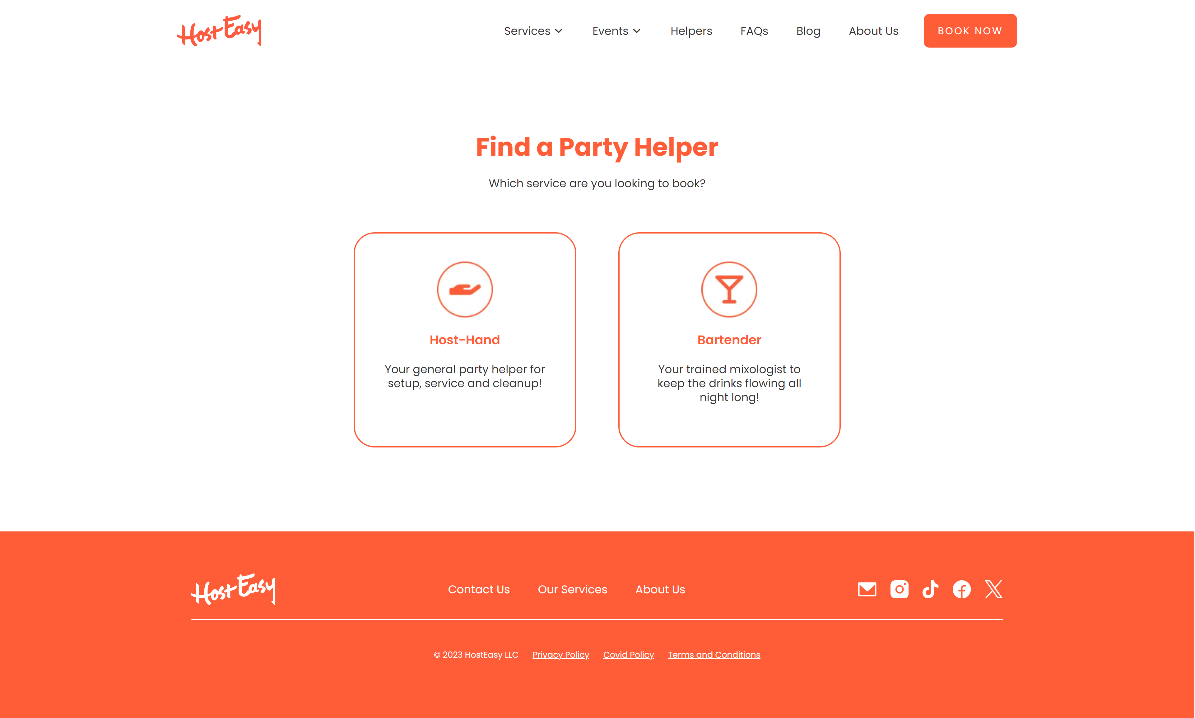
Final result
A Successful launch
In 2 months, we the team could successfully ship the new website on Webflow. This website is still functioning and some pages and sections were newly added later. A quick pivot decision, adaptable team and collaboration helped us deliver this website with a lean budget, conservative time.
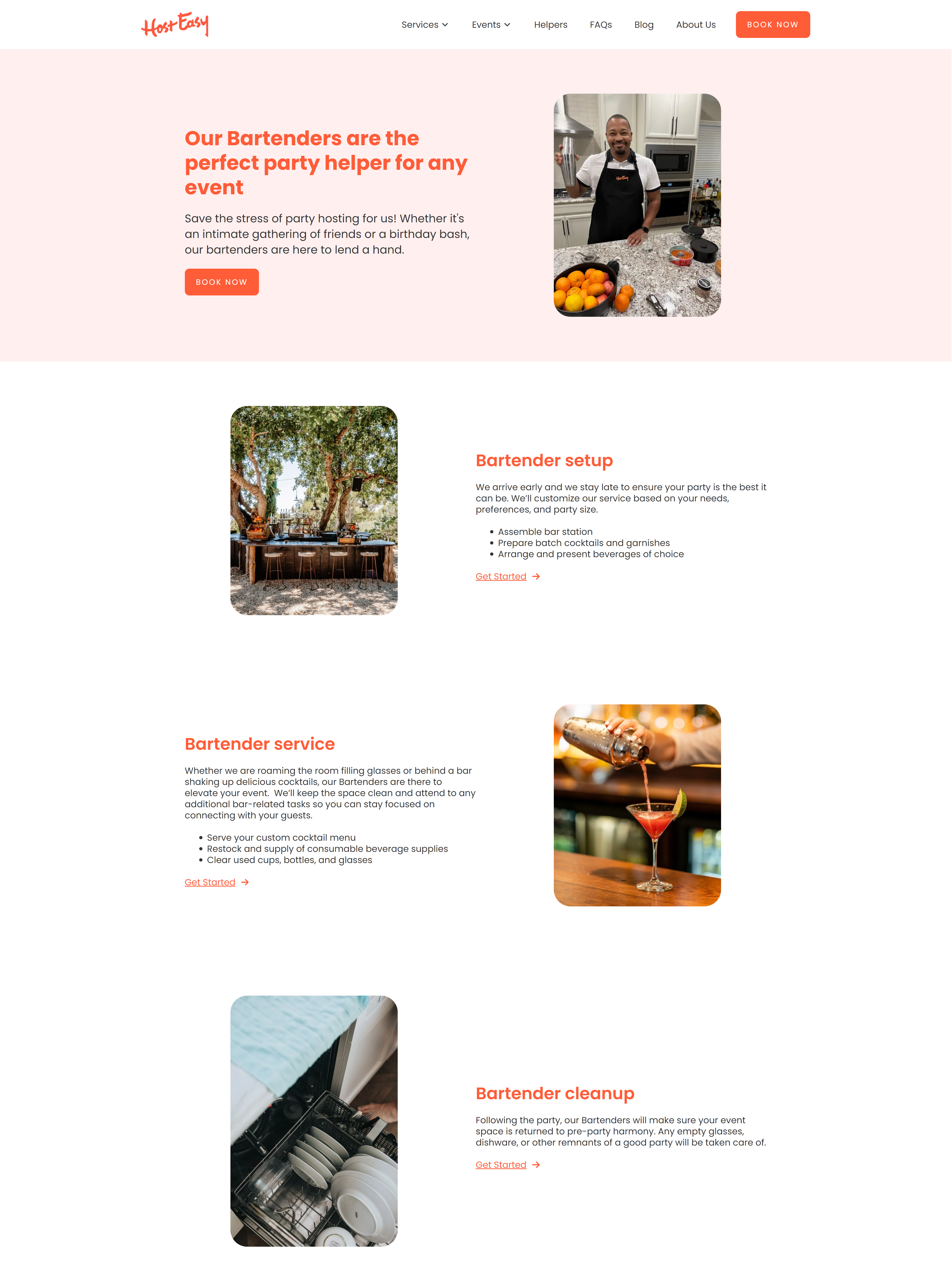
Bartender page
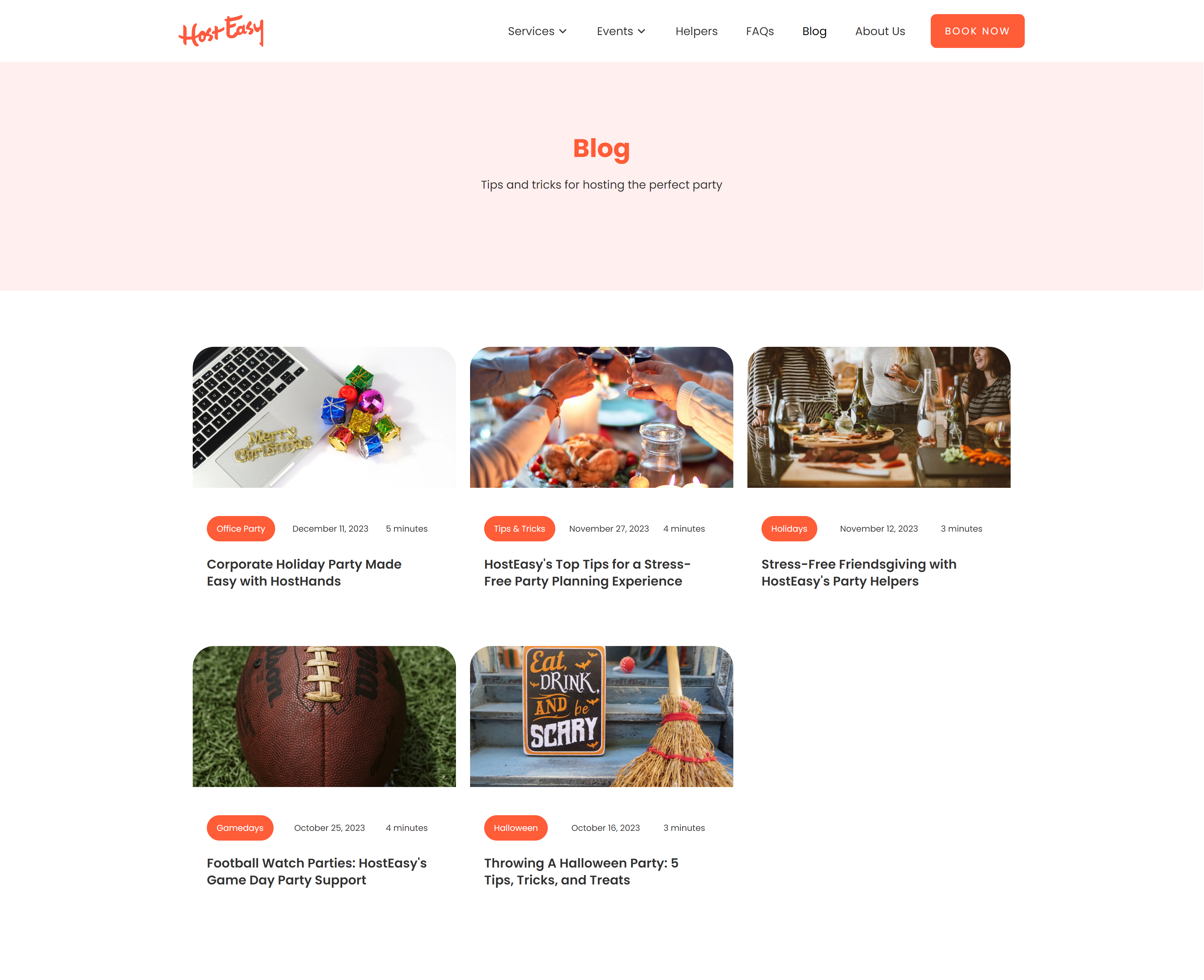
Blogs page
Trade-offs
Built-from-scratch website gives you the ability to mold the product according to your needs. With Webflow and integration 3rd party apps, we had to face trade-offs, primarily, with subscriptions and integrations.
Example: For the Admin, the Stripe integration with the PM tool Monday.com was partial. Admin could not charge from Stripe through Monday.com, Admin had to manually process invoicies on Stripe and keep it updated in Monday.com. But the founder was okay with undertaking some manual tasks on the backend, and aligned with this trade-off for a better functioning website for customer ease.
Things that went right
Initially, not in my scope, this problem presented me with various diferent challenges than design. I was glad to play a role in influencing strategy and opertionalize it with a quick turn around.
1. Being adaptable. Products can break and to ensure the customer side business is running, being agile and adaptable to newer platforms was key.
2. Learning beyond my scope. Learning 3rd party integrations with PM software was a new learning experience, as it gave me in-depth insights of business automations and streamlining.
For Future
1. Automations research. Many integrations were partial, had I had more time, more reserch would have led for better workflows.
2. Navigating expectations. With initial friction of the buggy site, I should have had more realistic break down and expectatons about the project timelines.

TrellisContract project • App design • Product design
Anew VistaWebsite Redesign • Volunteer project
Thank you for visting and let's get in touch.
Find me on LinkedIn or shoot me an Email at samlele27@gmail.com
Designed by Sampada Lele

