
Dear Reader
This portfolio project highlights Information architecture, Navigation menu design, User Research and Collaboration with UX research. Status: Ongoing
Anew Vista Community
Anew Vista Community is an Ed-tech Non-profit organisation which provides free tech education to seniors. They conduct online and offline classes about digital safety, health apps, devices, etc.
Product designer / Volunteer / Jan 2024 - current / Collaborating with the COO, UX researcher, UX designer and 1 Full stack engineer
Challenge: Redesign the entire website
Current Focus: The Navigation menu (Nav)
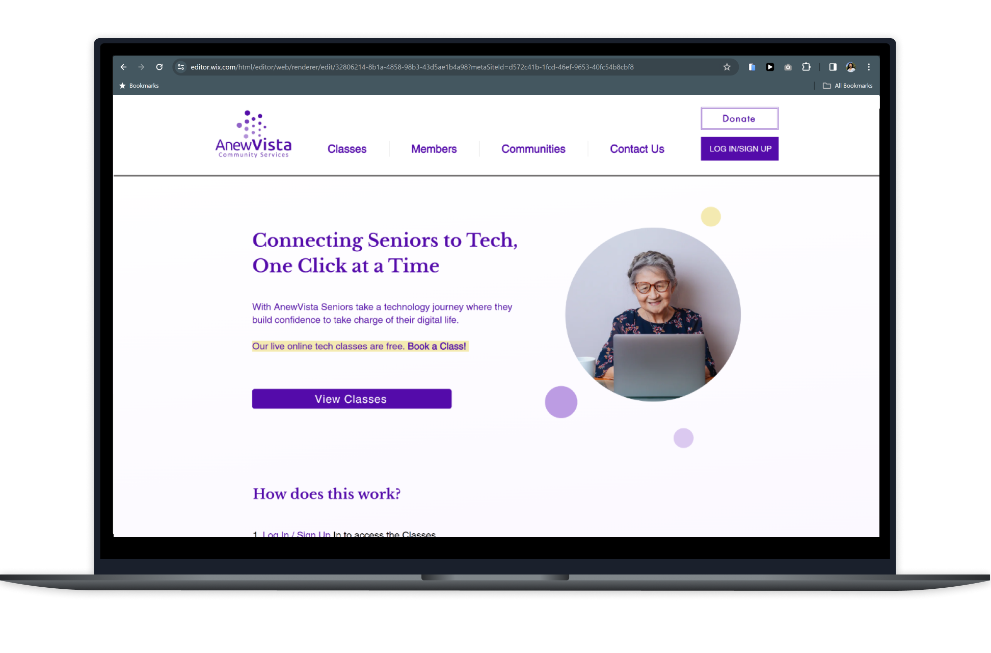
Anew Vista's website was launched in 2019. Since then, they have grown bigger. They currently have 600 online users registered in their CMS. They conducted 164 online classes in 2023, with an average attendance of 25 seniors per class. They are also affiliated with 7 senior communities locally in the Bay area.
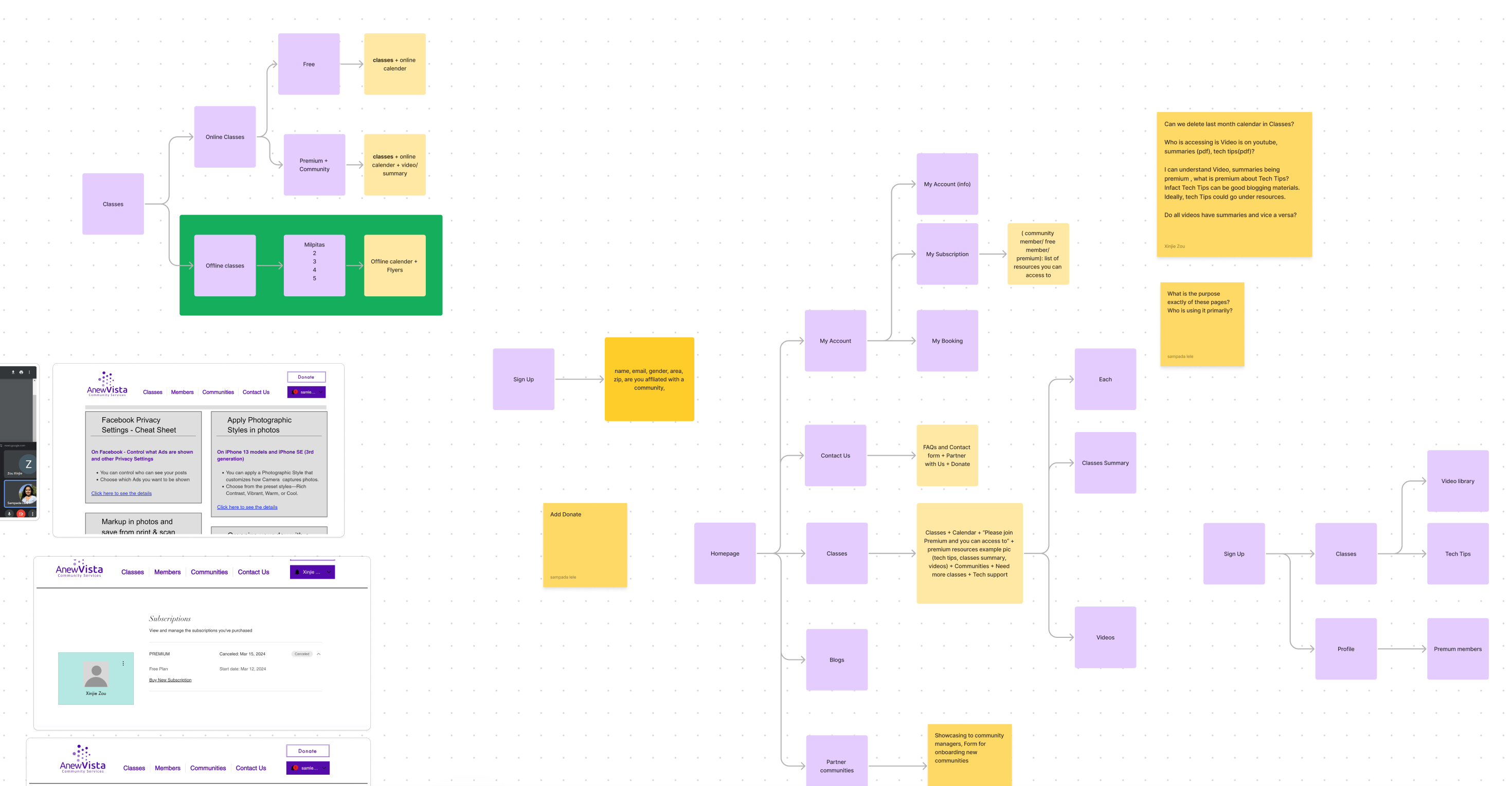
Their website, since it's conception was built on WIX and over the years has been facing significant usability issues. The COO approached me to redesign their website as a whole. Redesigning the website needed a deeper understanding of the Sitemap / Information architecture of the current website. Our primary step towards the redesign was, reimagining the Navigation Menu (Nav).
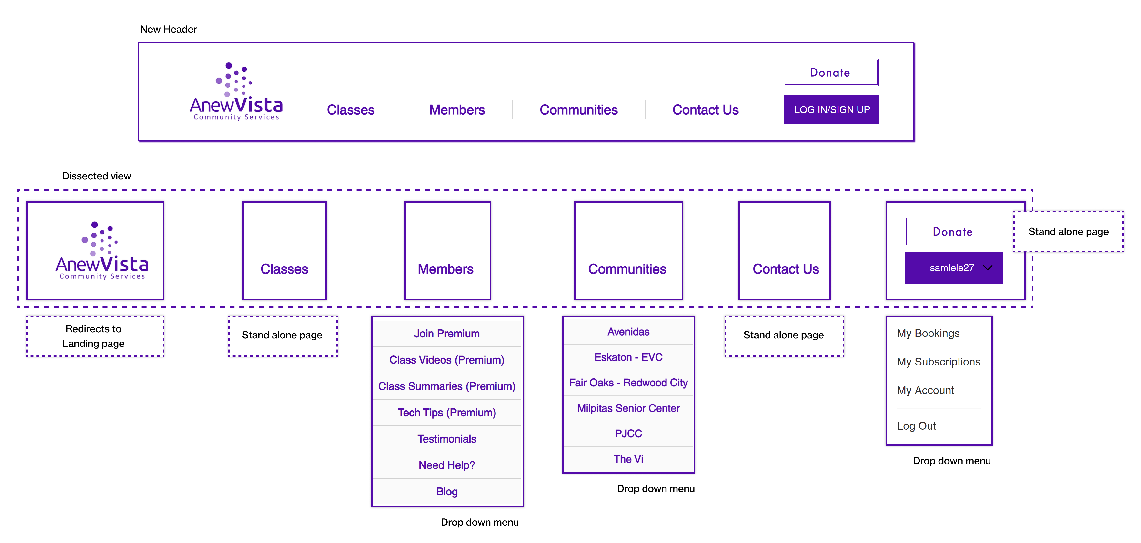
Dissecting the Nav
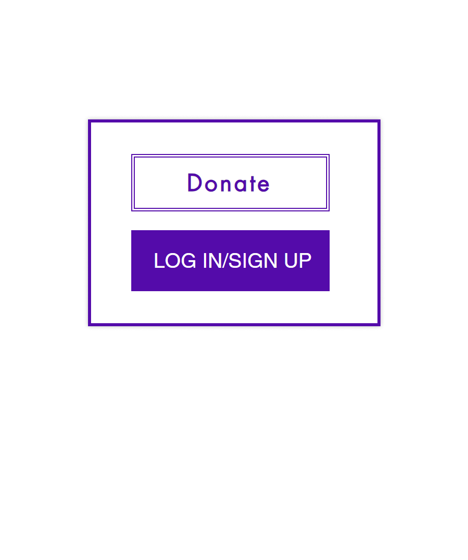
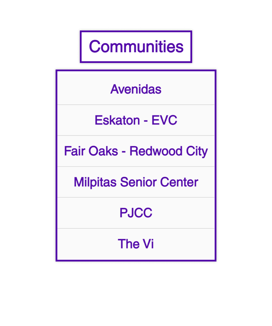
Anew's header consisted of 4 main buttons Classes, Members, Communities and Contact Us. It also consists of a vertically stacked Log In and Donate buttons. Members and Communities are umbrellas to further submenu items. We mapped the pages accordingly, and audited them based of their relevance, content and data.
Auditing helped us raise critical questions
"Discovery of the premium benefits is not the burden of the Navigation menu to bear"
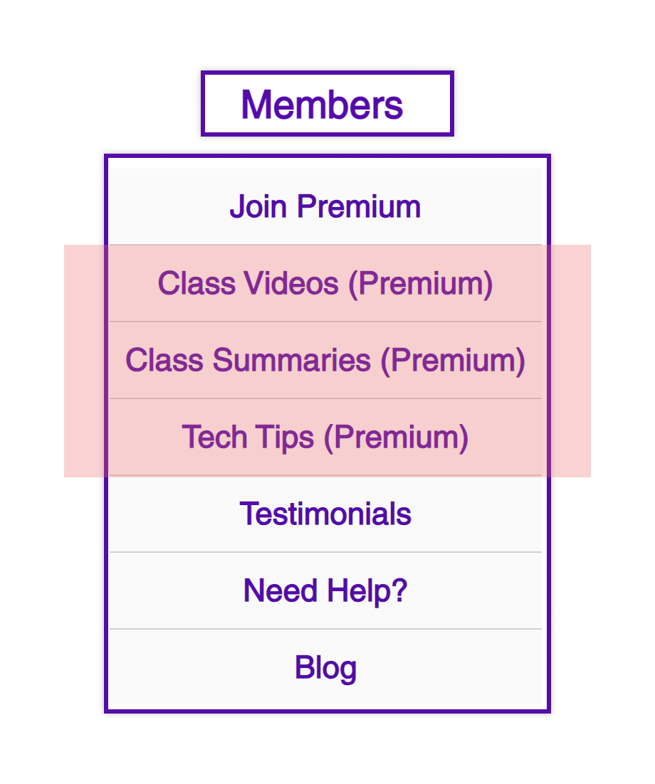
Asking Premium Questions
- Why do the 3 Premium sub-menus end up in a Log In screen? How is this benefitting the first time user?
- Can the Videos, Summaries and Tech Tips merge? How many hits do we get on these pages?
- Why are the "Testimonials" hidden under a menu?
- Is there a more appropriate place for "Need Help/FAQ's" ?
- Blogs should be accessible to all, does "Blog" need to be regrouped under a different menu?
Asking Community Questions
- Unsual to see a horizontal menu with vertical stacked buttons Donate and Log-in button together. Why is the donate button not on the same line of the Main menu?
- What is the purpose of the communities pages?
- Are these communities pages just surfacing the Calender PDFs for file sharing?
- Many communities just direct to the classes page, why do they need their own page?
Collaboration with UX Researcher Claire Zou
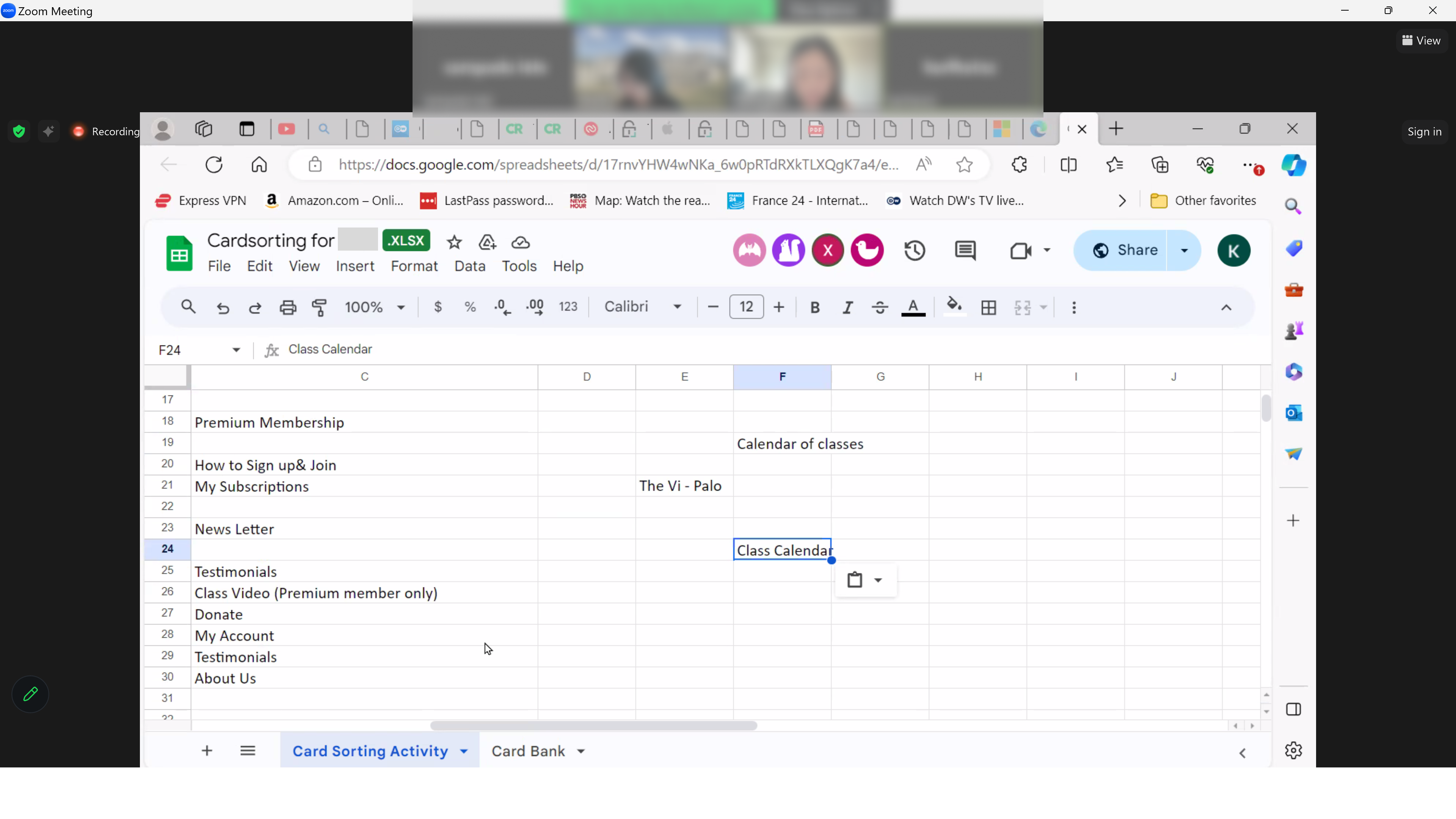
With preliminary menu auditing completed, we decided to deep dive move in to user research to find out how seniors view the current website.
- Card Sorting on Google Sheets
- 1 moderated and 15 unmoderated sessions
- Optional Post-test survey after unmoderated sessions
Results, Recommendations and Small Surprises!
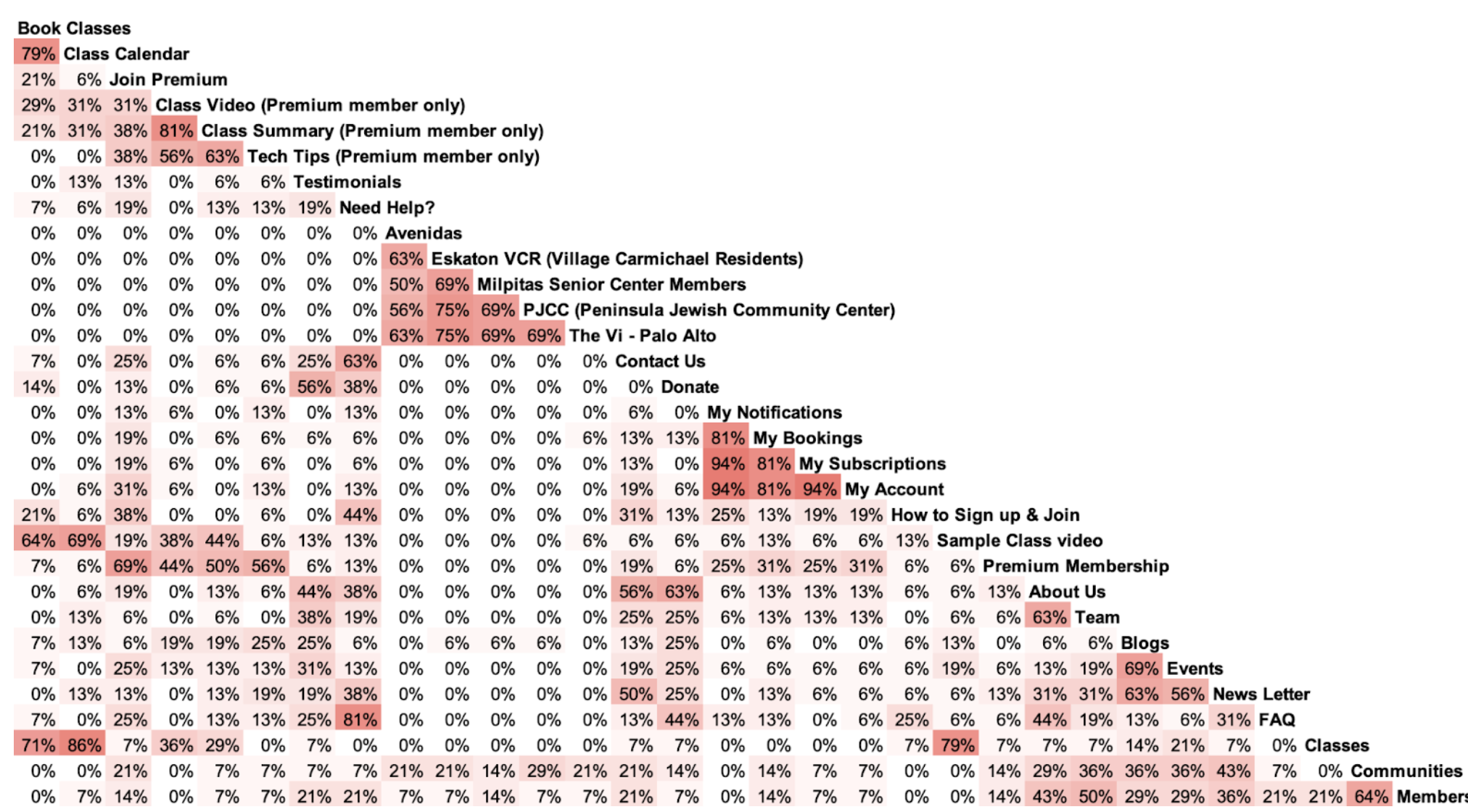
We got Quantative results on the groupings that were selected by the users. Example: 79% of users grouped Book Classes and Class Calender together, which makes it a high likability grouping in the Information architecture.
Qualitative recommendations recieved during the feedback.
- Considering renaming the following section names: Tech Tips, Testimonials, all the community names, and Team.
- Overlap between Premium membership and Classes section. Removing the premium membership section and integrating all the subsections into other sections may be a viable option.
Small surprises came in, were seemingly different entities came together unexpectedly. Example: We were under the impression that a sample class video would be perfect on the Landing page for new users to checkout but 69% regular users clubbed that with the Class Calender. Testimonials would be perfect on Landing page but 56% users saw it fit with Donations as well.
Simplyfing the Nav
Collaborative workshopping sessions on Figma Jamboard
New Navigation Menu
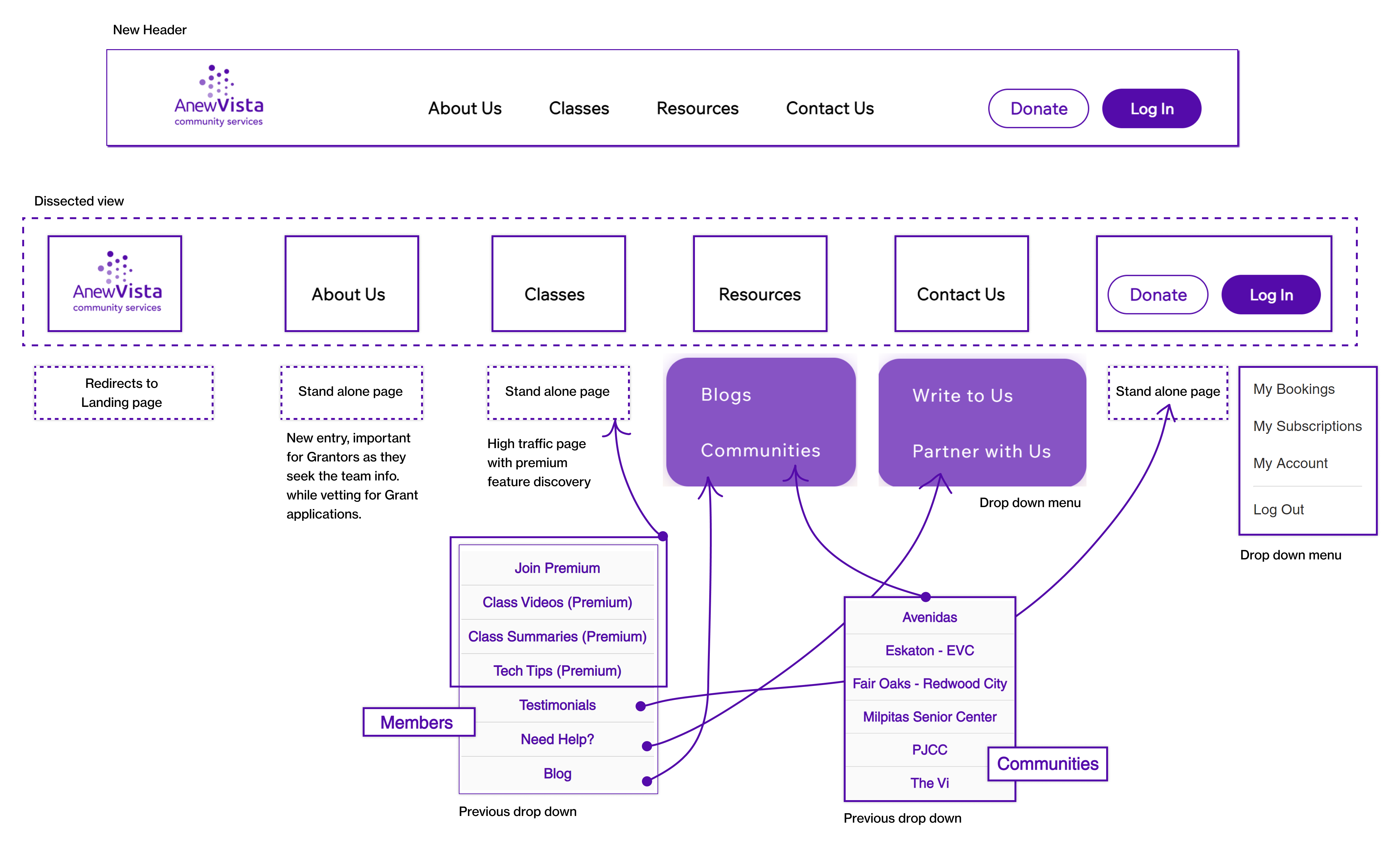
New navigation menu aligns more with the user research findings. Previous sub-menus get assimilated within various pages for easier navgiation/usability. New tab like About Us is included to add credibility.
Readable. Adding Colors and Shadows around the dropdowns to highlight it against the background. Hover State. To highlight selected tabs
Easy Mobile Menu. 81% of users use Desktop, but by simplifying the sub-menus, we can easily incorporate the new menu items in the Mobile version as well.
Lessons for future??
This story is unfolding, this project is underway.. more updates to come in May!
Thank you for visting and let's get in touch.
Find me on LinkedIn or shoot me an Email at samlele27@gmail.com
Designed by Sampada Lele